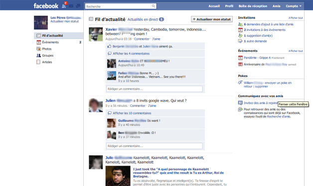
Update: Some Facebook users are reportedly now seeing a new Facebook design that looks like the screenshots here. The design is similiar to the one below, with some slight differences.
Original Article: Reports and screenshots have surfaced indicating possible further design changes to the Facebook home page. These changes would include an altered header with drop-down menus for things like chat, messages, and notifications (Via SAI).
There would also be greater emphasis placed on the search box. It would be moved further to the left, and more into the center of the page. Such emphasis on search would make sense, as Facebook has greater real-time search functionality these days than what it once had (particularly since its acquisition of FriendFeed).

Screenshot from French publication PCInpact.com (they have several more).
Let’s not get too carried away though. These changes are only tests at this point, and may or may not ever see the light of day for Facebook users at the mainstream level.
A Facebook spokesperson tells WebProNews, "We are continually experimenting with new designs on the site that are meant to simplify and improve the user experience. These are just a couple of the many changes we’re testing."
Whenever Facebook makes design changes, there is usually some amount of backlash from users. That doesn’t stop them from continuing to make tweaks, however. In the end, users are likely to get used to or accept the changes either way. I don’t think the world is ready to abandon Facebook for the next big thing just yet.
Do you like what Facebook has been doing with its design so far? Share your thoughts.
Related Articles:
