WebProNews

Tag: UX

  • Daniel Miessler: Google Being ‘Left Behind Due to Horrible UI/UX’

    Daniel Miessler: Google Being ‘Left Behind Due to Horrible UI/UX’

    Respected cybersecurity professional and tech writer Daniel Miessler is making the case that Google is being “left behind due to horrible UI/UX.”

    While many think of user interface (UI) and user experience (UX) in the content of desktop applications, UI/UX design is an important part of web app development. Especially as web apps have rivaled desktop apps for power and abilities, the line between the two categories has become increasingly blurred, making UI/UX more important than ever.

    Unfortunately for Google, the company appears to be lagging behind in its UI/UX efforts, according to Miessler. While acknowledging that Google Analytics’ poor interface was at least partially excused by the engineering-centric nature of some of Google’s products, Miessler points out the problem is spreading.

    “But lately it’s just becoming too much.

    • Even Gmail is a cesspool at this point. Nobody would ever design a webmail interface like that, starting from scratch.
    • What happened to Google Docs? Why does it not look and behave more like Notion, or Quip, or any of the other alternatives that made progress in the last 5-10 years?
    • What college course do I take to manage a Google Analytics property?”

    Miessler highlights an important factor that should be a concern to Google, or any incumbent company: agile startups like Quip. Years ago the barrier-to-entry was much higher for companies looking to break into the software development market. In today’s industry, however, technologies, frameworks and APIs have progressed to the point where the barrier-to-entry is much lower. As a result, it’s important for companies to stay current, developing apps that people not only need, but also want, to use.

  • Simple UX Tips to Keep Your eCommerce Store from Losing Money

    Simple UX Tips to Keep Your eCommerce Store from Losing Money

    Shopping cart abandonment is a big problem that can lead to huge loses in revenue for your eCommerce business. However, there are various reasons why shoppers abandon their carts. Some customers might just want to browse your store items while others are simply not interested in what you have to offer. While some reasons for shopping cart abandonment are out of your control, improving the user experience of your online store will get more customers pass the checkout. 

    Understanding the Importance of UX

    User experience, or UX for short, pertains to the overall feeling a customer has when interacting with your eCommerce store. How positive the UX is usually depends on how enjoyable and easy it was for the visitor to navigate the store, find what they were looking for, and place an order. Conversely, issues like unclear pricing, site errors, and insufficient payment methods can cause people to abandon their carts.

    Companies might argue that loyal customers will put up with slight inconveniences. But these days, shoppers have numerous options for buying products and services online. Shopify.com alone has more than 500,000 merchants in about 175 countries. Regardless of how good your product or service is, there are competitors that offer something similar. And if they also provide a better user experience, well, it’s not hard to imagine where the customers would go.

    Ways to Improve UX in Your eCommerce Store

    A good UX can help attract new customers. More importantly, it helps online retailers retain existing customers and boost customer returns. If you want your clients to remain loyal and keep coming back, then you should look for ways to improve your store’s UX. Here are some suggestions:

    1. Enhance Search Results

    About 30 percent of your site’s visitors will be using the search tool. These guests know what they want and are very motivated to purchase it. So you should make it easier for these shoppers to find the product they want by enhancing your site’s search feature.

    Consider where your search bar is located. Place it in a prominent location, like the page’s header. Look at how Amazon positioned theirs—at the top center of the page. Make sure your website’s search feature can be found on every page. This consistency will make your product catalog more accessible and browsing go more smoothly.

    2. Use Good Photos and Improve Product Description

    One disadvantage to online stores is that you can’t hold the product, and customers want to see and touch things they plan on buying. One way to counter this dilemma is to provide clear and captivating images of the product.

    Online sellers have to make sure that they capture key product details in the photograph. Brands should ensure they display large product images and complement them with several alternative pictures and zoomed-in images. Don’t forget the product description. Add key information like available colors, size guides, weight, and other important specifications.

    3. Improve the Checkout Process

    A long and complicated checkout process is one of the main reasons for shopping cart abandonment. Luckily, there are some things you can do to make checking out go more smoothly. First, get rid of all unnecessary fields on the checkout form, like Gender or Birthday. Just stick to the information you really need.

    It’s also a good idea to optimize your site for mobile checkout by using big fonts, larger input fields, and a clear call-to-action (CTA) button. There should also be an indication to the user that their order is being processed. The “loading spinner” can be useful at this point, and it’s something that users would expect to see.

    4. Provide Good Customer Service and Positive Customer Interaction

    There are a number of small, and often neglected, things that can lead to positive customer interaction. Ensuring that banners, CTA buttons, and photos link to the right product is one. Using area maps to link to a specific product when there’s more than one being shown in a photo is another. You don’t want to get your customer’s frustrated. Help them find what they’re looking for and give them a positive experience to remember.
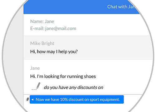
    Image result for live chat

    [Graphic via Wix.com]

    Pay attention to customer reviews, comments, and emails. Make sure you respond to all your users on your different social media outlets. A live chat system is useful since it gives users the chance to contact you immediately, like when they’re about to order but have some questions before making a purchase.

    A positive customer experience will do wonders for your store. Take advantage of the numerous tools and suggestions open to you on how to improve your site’s UX. But make sure you test it thoroughly.

    [Featured image via Pixel.com]

  • Will Google’s Navigation Interface Look Like This Soon?

    Google is testing yet another redesign of its navigation interface.

    It doesn’t seem like that long ago that Google launched the current navigation interface, but that doesn’t mean they’re not exploring other options.

    Alex Chitu at Google Operating System was tipped on a new test Google is running, which includes a more visual style for accessing various Google services. He provides this screenshot:

    New test

    I’m not sure where the Google+ notification counter is hidden in this version of Google’s design. I can’t imagine they’d want to do away with that, considering it was one of the key motivating factors to get users to visit and engage with the Google+ social destination.

    As Chitu points out, the design is kind of similar to the Chrome app launcher Google has been previewing. Google put out a post about this last week. Here’s what that looks like:

    Chrome App Launcher

    Google tests stuff all the time, and much of it never sees the light of day, so don’t freak out just yet. Google runs 20,000 search experiments a year, according to Matt Cutts.

  • What Do You Think of Gmail’s New Look?

    What Do You Think of Gmail’s New Look?

    It appears Gmail’s new look has been activated for all users.

    What do you think of Gmail’s new look? Let us know in the comments.

    Gmail's New Look

    Some new/updated features you’ll notice in Gmail are:

    New Conversation View
    The conversation view has been completely redesigned. You’ll now see see profile pictures for your contacts in your email conversations.

    Elastic Density
    With the new Gmail you can now control the spacing between elements on your screen. This can be modified anytime via the display density menu, located under settings.

    All New Search
    Gmail’s search has been improved with a dropdown menu which allows you to specify exactly what you want to search (e.g. emails to a certain sender, or a certain word in the subject or body). Email filters can also be created from the same menu, from any search.

    HD Themes
    The themeing system has been completely rebuilt, now each theme utilizes high resolution imagery. All of the current themes have been updated, and your current theme will be carried when switched.

    Navigation
    The left-side navigation has also received a facelift, as the new layout keeps your most used labels in view at all times. If you find yourself stuff being hidden by the collapsing menu, you can resize this by simply clicking on the dividing line and dragging it down. Gmail will remember your new menu settings.

    For those of you who hadn’t made the change yet, Google has made it for you. The next time you login to your Gmail account you’re greeted with a box welcoming you to Gmail’s new look accompanied by the following video:

    Not a fan of the new look? Well you can, “temporarily postpone the switch to the new look in the new settings menu“. But what’s the point in that? As Gmail’s new look will more than likely be made permanent in the near future… better just get used to it now.

    Google’s Gmail blog has been taking an in-depth look at Gmails new look. Today they posted about activating the changes everyone:

    The dedication of our testing team helped us catch bugs early so we could fix them in preparation for launch. Once we felt that the new look was good enough to be used by others, we turned it on for all Googlers.

    Sure Google is happy with the changes, but a lot of Twitter users don’t agree:

    New gmail, you are decreasing my productivity. #ihatethenewgmail 12 minutes ago via TweetDeck · powered by @socialditto

    #Gmail finally made me switch to a “new look”. I haven’t been missing out. It is bullshit. Where is the old one? 3 minutes ago via web · powered by @socialditto

    What the HELL did they do to Gmail??? 13 minutes ago via web · powered by @socialditto

    I don’t like the new look for Gmail because the dark theme is now all black black instead of the black, grey and white I’m used to 🙁 14 minutes ago via web · powered by @socialditto

    The new gmail format is so crazy!!! #idontlikechange 43 seconds ago via TweetDeck · powered by @socialditto

    I hate Gmail new look 🙁 2 minutes ago via Twitter for Mac · powered by @socialditto

    Though there are some out there who actually like Gmail’s new look, myself included:

    I *like* the new Gmail. There, I said it 10 minutes ago via TweetDeck · powered by @socialditto

    Love the new #gmail #design! @google 10 minutes ago via web · powered by @socialditto

    Pretty sure I’m the only person who doesn’t hate the new Gmail. 9 minutes ago via web · powered by @socialditto

    I’m fine with it, too. RT@AlyssaRosenberg: Pretty sure I’m the only person who doesn’t hate the new Gmail. 5 minutes ago via Twitter for Android · powered by @socialditto

    Lovin’ the all new Gmail layout. 🙂 4 minutes ago via web · powered by @socialditto

    It’s unclear at the moment how long users will be able to revert back to the old Gmail look, but why not just embrace the new look? It will be the default look very shortly, you might as well get used to it.

    Why do you think some people don’t like Gmail’s new look? Thoughts about the new look in general? Let us know in the comments.