WebProNews

Tag: redesigns

  • Etsy Announces Site-Building Tool ‘Pattern,’ Redesigned Landing Pages For Shops

    Etsy Announces Site-Building Tool ‘Pattern,’ Redesigned Landing Pages For Shops

    Etsy made two major announcements on Tuesday aimed at improving the selling experience. These are a new paid site-building tool called Pattern and a new redesigned landing page for Etsy shops called Shop Home.

    Pattern appears to be Etsy’s answer to ecommerce shop platforms like Shopify and site-building services like Squarespace. The main differentiator is that it’s all powered by Etsy and is integrated with the Etsy features sellers are familiar with.

    Pattern shops leverage the seller’s existing Etsy shop and the work they’ve already put into it on their own custom website on their own domain. It includes all shop listings and content, syncs orders and inventory between sites, and provides analytics integrated with Etsy shop stats. It also uses the same checkout and shipping tools sellers are already using.

    “The setup is quick and easy—for most shops, it will take only a few minutes—and offers five thoughtfully designed themes that sellers can choose from to personalize their sites,” explains Etsy’s Mike Grishaver. “Sellers can choose from themes that highlight their listings or ones that more prominently feature their brand assets, and they can customize each with shop logos and brand colors. Sellers with Direct Checkout enabled can try Pattern for free with a 30-day trial, after which Pattern is only $15/month.”

    “We believe Pattern will deliver a special shopping experience as well—a high-quality, modern and professional-looking ecommerce site with branding unique to that shop,” he says. “Pattern sites feature responsive webpages so they look great at any size, on any device. And, with co-branded Etsy checkout, buyers will be reassured that their purchase is secure and trustworthy.”

    The Shop Home landing pages are more customizable than the previous version. They’re mobile-friendly and give more sellers more creative control according to the company. They allow sellers to highlight their brands within the Etsy Marketplace.

    The design includes a prominent cover photo and the ability to rearrange listings in the desired order. Here’s the before and after:

    This is rolling out to all sellers over the coming week.

    Images via Etsy

  • Google Redesigns AdWords Interface

    As more searches now take place on smartphones than on computers around the world, Google announced it is redesigning the user interface of its fifteen-year-old AdWords product to better reflect today’s multi-screen world.

    The changes are aimed at businesses of all sizes and all objectives. The company has spent a lot of time collecting feedback and running studies, and has overhauled AdWords based on what advertisers have told them they do well and what they don’t.

    Jerry Dischler, Vice President of Product Management for AdWords said, “AdWords should be more about your business, and less about our product. We want everything to support the way you think about your business. From the way you express business goals to the way you measure and manage your ads, we want to make it super easy to execute and optimize campaigns based on your unique marketing objectives.”

    “You want the data you care about at your fingertips,” he adds. “From the campaigns that drive the most profit to the percentage of traffic coming from mobile, we want to surface insights and help you visualize them in more actionable ways. By seeing the data most relevant to your business goals, you can spend more time optimizing campaigns and identifying opportunities.”

    Dischler says with the new interface, you’ll be able to manage ad extensions and build reports from one place and with less clutter and “more intuitive” workflows.

    The overhaul is based on Material Design, which Google has employed in its other apps like Search, Maps, and Gmail.

    It’s not going to be available to all advertisers for quite some time. They’ll be sending out invites and continue to work on things throughout the course of this year and into next.

    Google recently released an update to AdWords Editor, which is now available to all advertisers around the world. This includes bulk support for TrueView video campaigns, callout extensions, and HTML5 ads.

    Of course there is plenty of change on the user side of things as well. Google recently dropped right-side search ads (with a couple of exceptions), and added a fourth ad to the top of search results on some highly commercial queries. Here’s what various industry folks have had to say about the changes.

    Image via Google

  • LinkedIn Mobile App Gets Major Overhaul

    LinkedIn Mobile App Gets Major Overhaul

    LinkedIn just launched an overhaul of its mobile app, which is navigable by five main sections: Your Feed (Home), Me, My Network, Messaging, and Search.

    “We’ve not only rebuilt the new Flagship app from scratch but we have taken everything you love and more to develop a mobile experience that is more intuitive, smarter and dramatically simplifies your LinkedIn experience,” says LinkedIn’s Joff Redfern. “We know time is scarce, so we made it as easy as possible for you to connect to your professional network and stay informed about the conversations and content most relevant to you.”

    The five sections are fairly self-explanatory, but there are some changes to how everything works. For your feed, for example, LinkedIn will now ask you what content you’re actually interested in.

    The Me section includes everything about you such as who has viewed your profile, who is commenting on or sharing your posts, and of course your profile itself, which you can update easily from there.

    My Network shows what’s happening in your professional network, people you may know, new posts from your network and related suggestions. You can sync your calendar and be prompted to look at profiles for people you’ll be meeting with.

    “Messaging abandons email in favor of a more casual way to stay in touch, allowing you to initiate quicker conversations in a lighter-weight interface,” says Redfern. “This makes it easy for you to ping someone in your network on a quick question or continue a conversation as you would in real-life.”

    According to the company, the search function is now 300% faster as well as smarter, enabling you to get results before you finish typing.

    The new app is available for iOS and Android in the App Store and Google Play Store respectively.

    Image via LinkedIn

  • Yahoo Search Gets Overhaul on Firefox

    Yahoo Search Gets Overhaul on Firefox

    Yahoo announced that it’s giving Firefox users in the U.S. a new desktop search experience. This includes a redesigned header and more prominent image and video results.

    The design will be especially noticeable when users search for famous people and movies. They’ll see a strip of related videos and images across the top of the page.

    “Taking a page from our redesigned Yahoo mobile search experience, Yahoo Search in Firefox delivers the most relevant results upfront so that you can take action right away,” says Mason Ng, VP of Search Distribution at Yahoo.

    Also on display will be movie info from IMDb, movie times and ticket purchasing from Fandango, listening/purchasing from iTunes, photos/reviews from Yelp and TripAdvisor, stats from Yahoo Sports, and personalized Flickr results in image search, which was actually announced separately the other day, and applies across browsers.

    “We have accomplished a lot over the last year,” says Mozilla’s Denelle Dixon-Thayer. “We worked closely with Yahoo to improve the search experience for our U.S. users. And, while we tend to be an opinionated and passionate project, Yahoo has been collaborative and flexible as we’ve provided continual feedback. Ultimately, these advances in the experience improve the competitive landscape for search which is good for our users.”

    The new design is rolling out on Firefox on Windows, Mac, and Linux in the U.S.

    As you probably know, Yahoo has an agreement with Firefox that puts it as the default search experience in the browser. Ever since then, Yahoo has tried to push users to that browser. To this day, Yahoo still displays an “Upgrade to the new Firefox” message at the top of its home page in other browsers.

    Images via Yahoo

  • eBay Launches New Mobile Experience As ‘eBay 4.0’

    eBay announced he launch of eBay 4.0, a major overhaul of its mobile experience on Android and iOS. It includes what the company refers to as a “more browsable” design and provides users with improved access to top deals, promotions, and events. It’s also more personalized than previous versions.

    The app builds on eBay’s recently redesigned iPad experience, but adds adds more tools for sellers to manage listings and buyers to find the items they’re looking for.

    Introducing eBay 4.0 from eBay Newsroom on Vimeo.

    “Focused on creating more vibrancy in our marketplace, we’ve elevated selling within eBay 4.0, and have designed a more personalized experience based on a seller’s level and activity,” says Chief Product Officer RJ Pittman. “The new app offers more information to help first-time and new sellers be successful, and a new dashboard for more regular sellers with at-a-glance activity updates. We are passionate about creating a great experience for our buyers and enabling the continued success for our sellers.”

    “And we continue to engage our community for input,” Pittman adds. “Last month we introduced the largest public beta program for the new apps on both iOS and Android. The feedback from early testers has been quite positive, honest, and invaluable. We greatly appreciate our customers’ insights about key features and functionality, and their input on the design and overall experience.”

    eBay 4.0 is currently available in the App Store and Google Play.

    Image via eBay

  • Google Gets New Logo, ‘Identity Family’

    Google Gets New Logo, ‘Identity Family’

    There’s a lot of change going on at Google. Last month, the company announced the creation of Alphabet, making Google just one company underneath the larger umbrella which also houses some of its more ambitious endeavors.

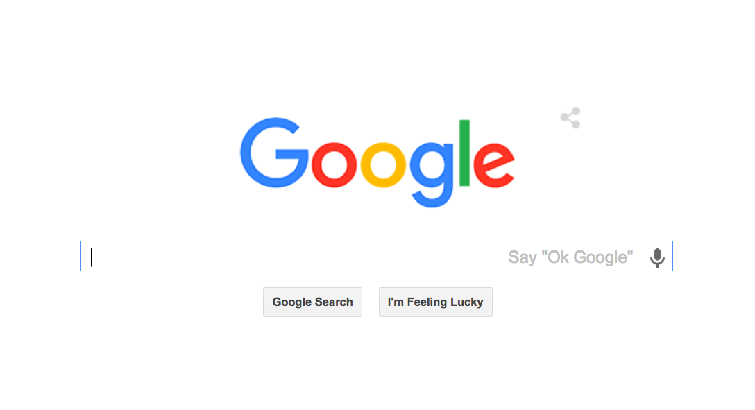
    But Google itself, which has seen a great deal of change over the years, is getting a new look, “identity family,” and “visual language”. Basically, it’s getting a new logo and look-and-feel. Google explains in a blog post:

    As you’ll see, we’ve taken the Google logo and branding, which were originally built for a single desktop browser page, and updated them for a world of seamless computing across an endless number of devices and different kinds of inputs (such as tap, type and talk).

    It doesn’t simply tell you that you’re using Google, but also shows you how Google is working for you. For example, new elements like a colorful Google mic help you identify and interact with Google whether you’re talking, tapping or typing. Meanwhile, we’re bidding adieu to the little blue “g” icon and replacing it with a four-color “G” that matches the logo.

    This can explain even better:

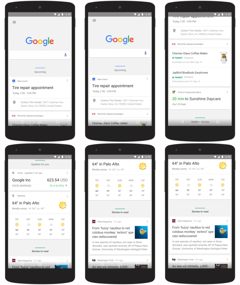
    It’s not just about the logo and dots though. Google has also upgraded the search results page on mobile. Here’s a look:

    On Android, the “home page” of the Google app has been adjusted to organize Google Now card by category to make things more predictable. The cards will shift and change size based on importance as the day progresses:

    Here’s a look at Google’s evolution:

    Images via Google

  • Marketing Tools Get Instagram Ads API Integration

    Marketing Tools Get Instagram Ads API Integration

    In June, Instagram announced it would make advertising available through an Ads API and Facebook ad buying interfaces in the ensuing months, in an effort to open up ads to businesses of all sizes. It said it would open API access to a select group of Facebook Marketing Partners and agencies first, and would expand it globally throughout the year.

    On Tuesday, the API Partner program launched. Whereas in the past, advertisers would have to work directly with Instagram sales people. Now, they don’t. They can start advertising on Instagram as they’ve been able to do on Facebook and Twitter.

    Make no mistake. This is big. In fact, it’s even been referred to as “one of the most anticipated moments in the evolution of advertising.”

    Business Insider shares a statement from Instagram: “”The Instagram Ads API will help us make ads more relevant to the community, serve more diverse business objectives, and make buying on the platform easier for advertisers. We started working with a group of Facebook Marketing Partners a few weeks ago and they’ve brought great experience and technological savvy onto the platform. We’ll continue to build upon the Instagram Ads API in the coming weeks and months.”

    Third-party API partners already on board include Salesforce, Hootsuite, Kenshoo, Ampush, Nanigans, SocialCode, Brand Networks, Unified, and 4C.

    “The integration allows marketers to use Social.com for managing advertising campaigns at scale, Active Audiences to unlock and sync CRM data in Salesforce to optimize advertising and Social Studio for publishing, engagement, customer service, and analytics,” a spokesperson for Salesforce tells us about its us of the API.

    “Instagram is the mobile marketer’s platform of choice for a highly engaged and growing audience,” says Jesse Pujji, CEO and co-founder of Ampush. “It presents a great opportunity to deliver in-feed, mobile advertising at true scale with its user base of over 300 million monthly active users. AMP’s integration with Instagram will allow our customers to advertise across a visually dynamic environment for consumers with a highly active community. Our strategic and in-house creative expertise, paired with our marketing solutions, delivers a unique ability to bridge audience engagement with revenue.”

    Instagram has over 300 million monthly active users. Beyond the API, Instagram has been doing more to improve its ad offerings including direct response that enable users to buy products or download apps, and expanding targeting options. More on all of that here.

    Image via Instagram

  • Netflix Website Gets Big Redesign

    Netflix Website Gets Big Redesign

    Last month we heard that a Netflix web redesign was on the way. Today, Netflix officially announced it.

    Netflix last launched a redesign four years ago, and lot of people hated it. Eventually, they moved on. It will be interesting to see if the new one goes over better.

    “Over the past four years, web browsers have changed a lot, becoming more sophisticated and allowing for richer visuals and animations. How our members use Netflix has changed too. We’re spending more and more time using mobile and tablet apps,” says Netflix’s Cameron Johnson.

    “With the new Netflix website, we’ve created a richer, more visual experience, and a website that works more like an app and less like a series of linked web pages,” he adds. “Information appears in-line and in context rather than on a separate page, which makes exploring the catalog faster than ever before.”

    When a user hovers their mouse over a title, it will show a slideshow of images from it:

    When a user slicks on the title or synopsis, a detail pane opens, which lets you browse episodes, or read details and reviews. There’s a “More Like This” link to let you check out similar titles. You can also browse titles from the same cast, genre, or mood.

    Additionally, Netflix says scrolling through rows is much faster. You can click your mouse to advance a full row at a time. This should be much appreciated by users as the slow scrolling has long been one of the biggest knocks on the old design.

    They’re starting to roll out the new look globally, but you may not see it right away. It will take roughly two weeks for it to make it to everybody.

    Does it look like an improvement to you?

    Images via Netflix

  • Flickr Just Got A Big Redesign. What Do You Think?

    Flickr just unveiled a major overhaul of its upload, photostream, share and search experience across mobile and desktop. It comes with the company’s advanced image recognition technology.

    “This new set of tools and powerful search will make it easier to access, organize, and share your photos anywhere,” a spokesperson for Flickr tells WebProNews.

    So far, I haven’t seen a lot of feedback from users, which is probably a good sign. You definitely see a lot more when users don’t like the changes to a product.

    In a note on the Flickr blog, director of user experience and design Shaun Forouzandaeh writes:

    We’re on different devices and platforms at different times and we never want to think twice about accessing the photos we love and want to share. Flickr for iPhone, iPod, iPad, Apple TV, Android, and Web is now a unified design experience, working seamlessly wherever you are. In addition there are Flickr Uploadr apps for Windows and Mac OS, which allow you to quickly upload thousands of photos up to the Flickr cloud.

    Refined, crafted, and vibrant, Flickr’s new design helps users understand the product as they use it, with new ways to experience gorgeous photography. The UX will help you find photos effortlessly, organize with hyper speed, make pixel edits without destroying originals, and share seamlessly with control over privacy.

    The new desktop Uploadr apps work in the background and provide notifications letting users know when photos have been found and take them directly to them on the web as soon as they’re uplaoded.

    There’s a new profile and camera roll. The main management view now displays and organizes thousands of photos and provides you access to tools as you need them. When you scroll, a timeline scrubber appears so you can jump back and find a particular moment in time more easily.

    “Select photos and the action tray appears, giving you the right control at the right time,” explains Forouzandaeh. “This simple, powerful Camera Roll is the new home for all your photos in the apps and on the web. With refined typography, consistent grids, and useful tools, your photos feel more organized and beautiful from every angle.”

    In an effort to remove friction from the management interface, Flickr has implemented a multi-select swipe gesture on mobile and a click-and-drag experience on the desktop. When photos are selected, the action tray appears with editing tools and options for sharing and creating albums.

    Additionally, in edit mode on mobile, you can swipe over and down with one gesture to select a range of images more easily. Again, click-and-drag works on desktop.

    There’s a new unified search experience that lets you search your photos, photos from people you follow, and the billions of photos on Flickr with a single query. There’s also a new set of filters on the web version for primary color search. You can also combine color filters and aesthetics like minimalism, and depth of field. The search engine recognizes patterns and understands objects and aesthetics.

    They’ve also made design tweaks to comments and descriptions, lightening the backgrounds and placing greater emphasis on the photos themselves.

    What do you think? Big improvement?

    Images via Flickr

  • Twitter.com Is Now Useful to Those Who Don’t Use Twitter

    Twitter.com Is Now Useful to Those Who Don’t Use Twitter

    If you don’t “use” Twitter (and by that I mean tweet, retweet, favorite, and follow people) or had no intention of signing up, visiting Twitter.com served no purpose. Until now.

    Twitter.com is now useful for people who don’t really want to jump headfirst into the whole Twitter experience. Of course, Twitter hopes that its homepage redesign will lure new users – but even if you have no desire to join Twitter, you can still check out tweets from news outlets, comedians, athletes, musicians, actors, and more directly from the homepage. What used to simply feature a signup/sign-in box now offers categories for logged-out users to browse.

    “Every month, hundreds of millions of people come to Twitter to see what’s happening in the world. After all, it’s often the best place to turn to for information and commentary on live events and breaking news,” says Twitter. “People who log in get the full experience: they can browse the complete catalog of public Tweets, Tweet themselves or engage with Tweets they see. Today, we’re making a big change for the many millions of people who visit every month who don’t log in, but still want to know what’s happening.”

    Twitter.com now features a bunch of categories, which when clicked open curated timelines featuring popular users in said category. For instance, clicking on the “Celebrity chefs & personalities” box opens up a stream featuring tweets from the likes of Rachel Ray, Ted Allen, Emeril Lagasse, and Guy Fieri. Clicking on the “hip hop/rap artists” tab pulls up tweets from Nicki Minaj, Pharrell, Ice Cube, Pusha T, and more.

    Twitter.com currently sports 10 broad categories – news, sports, entertainment, technology, lifestyle, music, humor & novelty, arts & culture, fashion & style, and government & nonprofits. Each category has various sub-categories, for instance “celebrity news, TV shows and stars, and Video games & gamers” inside the Entertainment category.

    The new Twitter.com should be live for users in the US, and Twitter says it wants to expand it internationally over time.

  • Getting To Know The New Twitter Search

    Getting To Know The New Twitter Search

    Earlier this week, while searching on Twitter, I was presented with a revamped search interface, but only for a minute or two (luckily, it was long enough to get a couple screen grabs). Then it went away.

    Even while I was able to access this version of Twitter Search, it wasn’t working properly. None of the filters worked. They all just pointed to the old style results for “everything”.

    I searched Twitter to see if anyone else was talking about this, and a few others had mentioned seeing it. I asked Twitter about it, and was told, “I can confirm that we are experimenting with a new search experience.”

    Whether this will roll out to all users remains to be seen, but I have gotten the experience back, and now it works, and appears to be sticking around, at least for the time being. With that, let’s take a closer look.

    There doesn’t appear to be anything that’s really changed in terms of functionality. It’s pretty much just how search options are presented.

    When you search for something, you’re presented with filters for Top (default), Live, Accounts, Photos, Videos, and More Options. I’ll use the query “SEO” for an example. Here’s a look at the top results:

    For comparison, here’s what the old default experience looks like:

    Though there is a separate option for “live,” the top section adds results pretty quickly too, though this probably depends on the query.

    The live option is basically what used to be “all”. It’s just the latest results in real time.

    The accounts tab replaces what used to be “people” and more closely resembles other pages Twitter has that present you with accounts, such as the “Following” and “Followers” pages. Really, “accounts” is a much better description, as many of them are for brands and other things.

    For comparison, here’s the old “People” results:

    It’s worth noting that Twitter Search is smart enough to include Matt Cutts in the top results despite him not having “SEO” anywhere in his bio or Twitter handle.

    Here’s what the photo results look like with the new interface:

    Notice that you’re not presented with view options like on the old version. It just gives you the list view. I think I actually prefer the old presentation of this one, which defaulted to grid view, and gave you the option to view it in list view.

    The new interface feels more like you’re just looking at more tweets (granted they are photo tweets), whereas the old one puts more focus on the actual photos from the tweets. Since you’re searching for photos, I feel like the one that emphasizes the photos themselves works better, but I suppose that’s just a personal preference.

    The video search in the new interface is pretty much just like the old one. There aren’t any view choices, which is interesting because the old version let you choose between all and Vine. There’s no Vine option on the new one.

    Twitter of course recently launched native video, so perhaps they’re placing less emphasis on Vine for that reason.

    Under “More Options,” you get the following additional choices: News, From everyone, From people you know, From everywhere, Near you, Save this search, Embed search, and Advanced search. All of these options were previously available. They were just laid out differently. Personally, I think the new interface is a vast improvement in that regard, as it draws your attention to all of these options, which can really make Twitter’s search tool more useful.

    Here, I’ve highlighted where these options are located on the old version:

    And that’s pretty much it. The Advanced Search remains identical to the old version.

    Any of this may change by the time the new interface rolls out, if it even does roll out. Remember, Twitter just said it was experimenting.

    Interestingly, while I’m getting the new interface in Chrome, I’m not getting in Safari or Firefox. In Chrome, however, I’m seeing it for multiple accounts.

    Someone on Twitter had seen it in Safari, but not Chrome. I should also point out that I’ve not seen any change at all on the mobile app (Android).

    Overall, I think the new interface is an improvement over the existing one, and I hope they go in this direction. There are a few changes I would make, as noted, but in general, it feels like a step toward emphasizing search (which is really one of Twitter’s best features) and making its usefulness more obvious.

    Images via Twitter

  • Twitter Confirms It’s Messing With Its Search Experience

    Twitter Confirms It’s Messing With Its Search Experience

    While covering Google’s closure of Google Moderator earlier, I searched Twitter on the desktop to see what people were saying about it (not much so far), and suddenly, just for a minute or two, Twitter was serving me a completely different search interface. Then, it was nowhere to be found. It actually went away before I left the page.

    Here’s what it looked like:

    I’m not the only one who noticed it:

    After seeing these tweets, I checked Safari (I was using Chrome), and I’m not getting it there either. I’ve reached out to Twitter for more information, and will update accordingly.

    As you can see from the screencaps, it lets you filter search results by the top ones, live results, accounts, photos, videos, news, those from everyone, those from people you follow, those from everywhere, and those near you. It also lets you easily save the search, embed it, or go to advanced search.

    Clicking around through the different options, I couldn’t get any of them to actually work. They all just directed me to the regular search results pages, showing results for “everything”. It was clear that the new interface wasn’t quite ready for primetime.

    What’s not so clear is if this is going to be rolled out to all users, or if it’s just a test. Hopefully, it’s the former, because this would be a huge improvement, and make Twitter better as a search tool. That combined with the fact that it now indexes every public tweet since Twitter began, make it a great resource for finding information. It should also keep Twitter itself as the best option for finding tweets even as it partners with Google.

    Update: It’s come back and gone away again.

    Update 2: A Twitter spokesperson tells us, “I can confirm that we are experimenting with a new search experience.”

  • eBay Redesign Doesn’t Go Over Very Well

    eBay Redesign Doesn’t Go Over Very Well

    This week, eBay launched a redesign for its iPad app, and it doesn’t seem to be going over very well. The company appears to be trying to make its experience less like Amazon and more like Pinterest. The problem is that people apparently don’t want their eBay experience to be like Pinterest.

    Do you think eBay should me gravitating to more of a Pinterest-like experience? Share your thoughts in the comments.

    Here are a few screenshots.

    Earlier in the week, Jason Del Rey at Re/code shared some words from Chief Product Officer RJ Pittman, the guy responsible for the new design:

    “I’m happy to openly use the Pinterest model as an example. We want this to be as much a source of inspiration as a shopping destination.”

    Right. Because people go to eBay for inspiration. In fact, that “inspiration” concept comes up in the product description on iTunes as well. There, it says:

    Inspiration is just a swipe away with full access to eBay’s millions of items on your iPad. Our trend spotters and style mavens highlight new unique items daily alongside special limited-time shopping events, trending collections, and remarkable deals that save you money. Whether you’re checking out what’s hot today, or digging deep for that one-of-a-kind find, a world of new and vintage merchandise from eBay’s sellers is waiting for you…Version 3.4 of eBay for iPad improves on all the buying and selling functionality you’d expect, while providing great new opportunities to be inspired.

    It doesn’t seem that users agree that the new version is an improvement. They certainly don’t seem very inspired. The current version has a rating of one and a half out of five stars. That’s out of 2234 ratings and compared to four and a half for all versions of the app. In other words, eBay has historically been highly rated, but this new version is a huge bomb. This is further evidenced by a glance over to the actual reviews. Here are the top ones at the moment:

    Del Rey shares some additional complaints, and notes that both buyers and sellers are complaining, which can’t be good.

    It’s certainly interesting that eBay is going out of its way to separate itself from Amazon, as Amazon just launched a new feature that puts it in even more direct competition with eBay. Earlier this week, the online retail giant launched the “Make an Offer” feature, enabling users to haggle with sellers, and try to get better prices.

    eBay also recently started pulling back on a feature that would directly compete with Amazon when it shut down the eBay Now app.

    What do you think of the new eBay iPad experience? Do you see it as an improvement? Let us know in the comments.

    Images via iTunes

  • LinkedIn Rolls Out Redesign Of Homepage

    LinkedIn Rolls Out Redesign Of Homepage

    LinkedIn is rolling out a newly designed homepage. Browse through this slideshow to get a feel:

    At the top, users will find a new dashboard with feedback on how they’re doing.

    It will show how many people have viewed your profile and how your status updates are performing. If you click on either of these items, it will give you more insights, such as who found your profile and how. It also shows how you rank across your connections, within your company, and other members who are similar to you. It lets you make quick profile edits to your profile as well.

    “Nurturing professional relationships is important,” says LinkedIn’s Elizabeth Burstein. “Now it’s easier to stay connected with the people who matter to you – through your Keep in Touch box up on the right. Share a comment, say congrats, or simply like an update in just seconds. We bring you up to speed with the latest developments in your connections’ professional lives – and then suggest more people you may want to add to your network.”

    “There’s another reason we’ve separated your network and dashboard: to highlight the great professional insights you can read on LinkedI,” she adds. “Get smarter and more informed for the day that lies ahead in just a few minutes by checking out the posts and articles in your feed that have been shared by your connections and written by Influencers and people that you follow.”

    The company is rolling out the new homepage this week.

    In other LinkedIn news, the company just revealed its top ten Sponsored Updates from 2014.

    Image via LinkedIn

  • Google Maps App Gets Design Revamp

    With the release of the latest version of Android, Lollipop, Google has been launching big updates for its major apps. In recent days, we’ve seen announcements about the new Google Calendar and the new Gmail.

    Google Maps is the latest to get a refresh, favoring material design and “bold colors and textures”.

    “This new look is all about creating surfaces and shadows that echo the real world; with Google Maps’ new material feel, layers and buttons come to life so you know just where to touch to get directions, recommendations and imagery,” says designer Evelyn Kim.

    When the user taps a place’s info at the bottom of the screen, a layer will glide up, and display pictures, reviews, etc. The Explore feature appears at the bottom of the map.

    U.S. users will be able to reserve tables at restaurants found on OpenTable from the app.

    “On a cool winter day, a chilly walk or train ride may not always be the most appealing choice,” says Kim. “Travelers deciding whether they should take an Uber or brave the frosty winds can now see estimates for Uber’s pickup time and price for their route in walking and transit directions in Google Maps. This option will appear if you have the Uber app installed, where available.”

    The update isn’t just for Android. It’s also hitting iPhone. Users should see the update over the next few days.

    Images via Google

  • Pinterest Gives Profiles An Update

    Pinterest Gives Profiles An Update

    Pinterest launched a new profile look for all users around the world.

    “The design, which was started by one of our engineering interns over the summer, draws on international feedback and gives a cleaner look that’s consistent across platforms,” a spokesperson for the company said in an email.

    For one, Pinterest has changed from square to round profile photos, and has centered the design. It has also relocated the follow button to the upper right-hand corner.

    It has added more options to the Gear menu, including a “Send” option.

    “On the backend, there’s more support for internationalization that allows us to more quickly support our 32 languages,” the spokesperson said.

    Pinterest is one of the few social networks that has actually been showing growth in terms of the amount of referrals it’s been sending websites. Shareaholic recently released its quarterly report on the topic, and Pinterest is still in second place when it comes to that. The only other ones actually growing referrals were Facebook, which is sending four times as much traffic to site as Pinterest, and Google+, which is sending far less. More on all of those numbers here.

    Image via Pinterest

  • Report: Yahoo To Launch New Homepage Next Month

    As you may know, Yahoo has been toying around with homepage redesigns again. It really hasn’t been all that long since the company launched a new look, but it apparently feels it’s time to start anew yet again.

    As reported earlier this month, users were seeing different versions floating around. Michael Bonnett Jr. tweeted this one out at the time:

    Now, Kara Swisher at Re/code is showing what she says is an internal screenshot from the company. This version is pretty similar to the one in the above tweet with a few tweaks. The biggest noticeable difference is that there is a larger number of trending searches at the top of the page.

    Swisher says that while this version could still change before the roll-out, CEO Marissa Mayer intends to unveil the new look next month. Apparently some of Yahoo’s sales team hasn’t been pleased with a smaller display ad on the right. This is understandable as Yahoo’s display businesses has declined, though search has been on the rise, as has its native ad business, which gets plenty of play in the new layout.

    Image via Twitter

  • Vine Adds Loop Counts, Redesigns Feeds

    Vine Adds Loop Counts, Redesigns Feeds

    Twitter’s Vine announced that it is now showing loop counts on its iOS and Android apps, and on the web, to show how many times people have looped a video.

    The loop counts also appear on Vine embeds around the web.

    “With this update, there’s now a new way for you to quickly get a sense of how popular and interesting a Vine may be –– based on how many times people watch a Vine loop,” says Vine API lead Mike Kaplinskiy. “The number, which you can see in our mobile apps and on vine.co, updates in real time, so as you watch a video, you’ll know you’re watching with others at the same time.”

    They’ve also redesigned the Home and Activity feeds.

    “Additionally, the feeds in our Android and iPhone apps now feature a new design, offering you bigger edge-to-edge videos and a cleaner view of likes and comments,” says Kaplinskiy. “Finally, we’ve revamped the Activity feed to make it easier to know what’s happening on your Vines. In addition to a new separation between New and Older Activity, you’ll also see a notification when your Vines surpass milestones (e.g., 25 or 100 likes).”

    He notes that some users may notice Vines showing a “+” next to the loop count. This is for those with loops from before April 3rd, which is the day it started tracking them. The “+” means a Vine has probably been looped more than what the number says.

    Before you go getting any ideas, they also have systems in place to prevent/combat loop count abuse/spam.

    Image via Vine

  • Netflix Gets A Site Redesign (Not Nearly As Drastic As The Last One)

    Netflix Gets A Site Redesign (Not Nearly As Drastic As The Last One)

    If you visit the Netflix website today, you’ll probably notice that it looks quite a bit different. For one, they finally switched over to the new logo they’ve been using on some things lately. This includes a new favicon.

    Beyond that, the top navigation bar is bit different, as is the coloring of the site.

    Last time Netflix rolled out a major redesign, there was quite a bit of backlash from users. That was about three years ago. I don’t expect that this time, as the functionality of the site has mostly been left in tact.

    That said, the absence of the DVD Queue link in the new design is a little annoying if you still use that service. You have to click over to the DVD site (which was recently rebranded), find the link, and click it from there. Still, that’s a pretty minor inconvenience.

    One reason that it’s been helpful to have access to the DVD queue from the streaming site is that you can easily see DVD titles in your queue that have become available for streaming, and add them to your list from there. 6.7 million people are still using the DVD service.

    Here are some titles coming to Netflix over the next week.

    Image via Netflix

  • Facebook Makes New Page Design Available To All

    Earlier this year, Facebook announced a new look for Pages, which included a redesigned Timeline, new options for admin tools, and a new Pages to Watch feature.

    On Wednesday, the company said the updated design will be available worldwide to all Pages later this week.

    “Admins accessing their Pages today will see a tour of the refreshed design,” the company said in a blog post. “After completing the tour, admins can switch to the new design right away. Admins that want to update their Pages before switching to the new design can wait up to two weeks before making the switch. However, every Page will automatically switch to the updated design two weeks after the tour has been viewed.”

    Facebook is also letting admins adjust the placement of sections in the top navigation menu.

    “We know how important Pages are for the millions of businesses that use Facebook every day, and we’re continuing to improve our offerings based on what we hear from them,” the company says. “To share your feedback on Pages, click the ‘Send Feedback’ link in the upper right-hand dropdown menu.”

    Facebook said this week that it has 30 million active small business pages.

    Image via Facebook

  • PayPal Just Revealed Its New Logo

    PayPal Just Revealed Its New Logo

    PayPal announced today that it has a new logo, and is altering its brand identity. Behold:

    “When PayPal was first founded in 1998, our image was designed for the online world…making it easier to pay and get paid online…right as consumers were considering e-commerce for the first time,” says Christina Smedley, Vice President, Global Brand at PayPal. “Today, online is just one of the ways we show up to our consumers, merchants and developers, along with in-store, on mobile and elsewhere. To reflect the dozens of ways we make it easier and safer for you to use your money every day, we’re pleased to share our new logo, designed to exemplify that simplicity, convenience and security in this new omni-channel world.”

    “With the help of award-winning design firm, fuseproject and feedback from people who use our products every day, our new brand identity flexes to fit all screen sizes, from wearables and mobile to the biggest, flattest high-definition TVs,” she adds. “It’ll be more legible and recognizable in both type and colors and will easily extend to be usable across the look/feel of various systems, and in the 193 markets we serve worldwide. Connection is a motivating principle behind the redesign — connection to money, to people and between people. It was important to evoke connection that was human and approachable, not too technical.”

    You’ll see the new look immediately on the PayPal site, as well as at Saks.com and zulily.com. It will also appear on all checkout buttons, apps, and PayPal Here devices throughout the year.

    Image via PayPal