WebProNews

Tag: logos

  • GoDaddy Adds Logo Design To Small Business Services

    GoDaddy Adds Logo Design To Small Business Services

    GoDaddy just announced the launch of GoDaddy Logo Design Service, which gives customers a way to “refine their online image” with the help of a professionally designed logo, which can be designed and customized to their own requirements.

    With the service, customers can provide business and design guidelines to professional designers, who will craft a logo tailored to these specifications.

    According to GoDaddy, the customer will get a new logo within three to five business days, along with art files that can easily be deployed across online channels.

    “GoDaddy Logo Design Service was developed expressly for small business owners, bloggers, consultants and other professionals with an online presence who are working to fine-tune their image and build a signature brand,” said Linnea Stenberg, Program Manager at GoDaddy. “The designer is available throughout the process to communicate directly with the customer to field any questions and ensure the finished product is perfect.”

    “GoDaddy Logo Design Service enables even the smallest brands to make a big impact, with eye-catching logos designed by experts exclusively for their brand at an affordable cost,” the company adds.

    Last fall, GoDaddy published results of a study finding that most “very small” business are still without websites. It stands to reason that these businesses could use a hand in the logo design realm as well.

    The company has put a major focus on small businesses since Blake Irving took over the CEO role in 2013. This service is only the latest such example.

    The Logo Design service costs a one-time fee of $199.99.

    Image via GoDaddy

  • Google Gets New Logo, ‘Identity Family’

    Google Gets New Logo, ‘Identity Family’

    There’s a lot of change going on at Google. Last month, the company announced the creation of Alphabet, making Google just one company underneath the larger umbrella which also houses some of its more ambitious endeavors.

    But Google itself, which has seen a great deal of change over the years, is getting a new look, “identity family,” and “visual language”. Basically, it’s getting a new logo and look-and-feel. Google explains in a blog post:

    As you’ll see, we’ve taken the Google logo and branding, which were originally built for a single desktop browser page, and updated them for a world of seamless computing across an endless number of devices and different kinds of inputs (such as tap, type and talk).

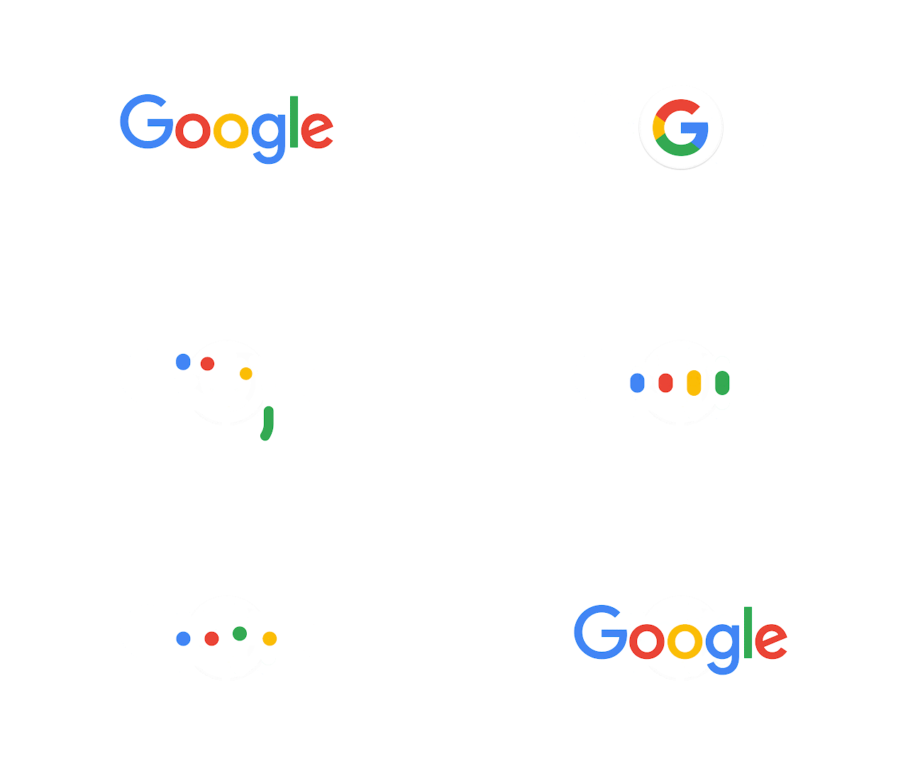
    It doesn’t simply tell you that you’re using Google, but also shows you how Google is working for you. For example, new elements like a colorful Google mic help you identify and interact with Google whether you’re talking, tapping or typing. Meanwhile, we’re bidding adieu to the little blue “g” icon and replacing it with a four-color “G” that matches the logo.

    This can explain even better:

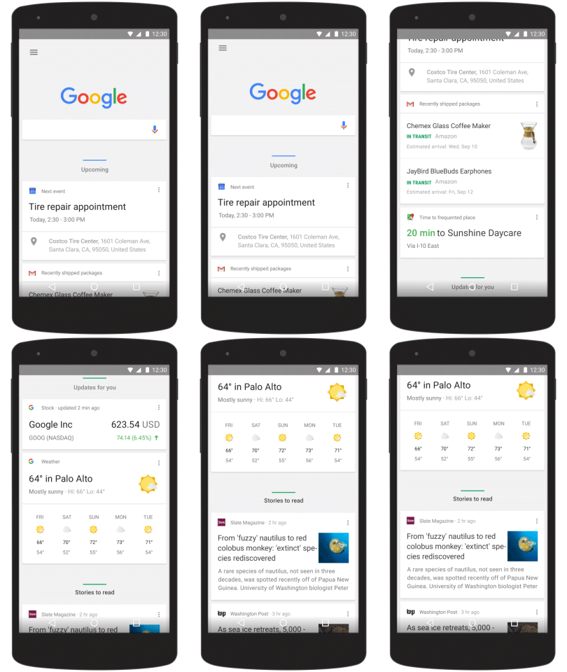
    It’s not just about the logo and dots though. Google has also upgraded the search results page on mobile. Here’s a look:

    On Android, the “home page” of the Google app has been adjusted to organize Google Now card by category to make things more predictable. The cards will shift and change size based on importance as the day progresses:

    Here’s a look at Google’s evolution:

    Images via Google

  • Facebook Has a New Logo

    Facebook has a new logo.

    No, it’s not a dramatic change. Facebook isn’t going all Airbnb. The subtle shift involves a different “a” and thinner lettering.

    Facebook Product Designer Christophe Tauziet revealed the new logo on Twitter:

    Here’s the old one, for comparison:

    Screen Shot 2015-07-01 at 8.51.06 AM

    The new logo isn’t live, but Tauziet says we should start seeing it “soon.”

    “Now that we are established, we set out to modernize the logo to make it feel more friendly and approachable,” Facebook creative director Josh Higgins said in a statement.

    The “f” logo – the one you see more often than the full “facebook” logo, will remain unchanged for now.

    What do you think?

  • Airbnb Goes Balls to the Wall with New Logo

    Airbnb Goes Balls to the Wall with New Logo

    I kind of feel bad for Airbnb.

    In a lengthy blog post, you can read about the company’s major redesign. This is a site-wide redesign that touches both web and mobile. Airbnb says that this is all about belonging. I believe them.

    Unfortunately, this massive overhaul is being overshadowed by the simple, but undeniable fact that the company’s new logo looks like balls.

    Not like balls as in bad. I mean actual balls…or a vagina…or a butt…or a butthole…or some hybrid of genitalia.

    If you’re not seeing it, well, I don’t really understand. But here are some other opinions that prove I’m not making a vagina out of a logo here:

    Wrong. According to Airbnb, it’s actually a “Bélo” – short for belong.

    “It’s a symbol for people who want to try a new tea they’ve never heard of from a village they couldn’t find on the map. It’s a symbol for going where the locals go—the cafe that doesn’t bother with a menu, the dance club hidden down a long alleyway, the art galleries that don’t show up in the guidebooks. It’s a symbol for people who want to welcome into their home new experiences, new cultures, and new conversations. We’re proud to introduce the Bélo: the universal symbol of belonging,” says the company.

    And I repeat – I feel so bad for these people right now.

    Airbnb also wants you to create your own version of the Bélo. They even made a fun little tool for it. I just made my own version!

    Oh my god, guys. How many levels of review did this go through?

    The genital nature of their new logo may not even be the biggest issue for Airbnb…

    Oh ok, fine. I don’t feel sorry for anyone. You brought this on yourself, Airbnb. THIS IS ON YOU.

    Image via Airbnb

  • Fox News Defends the Homeland, Copies Bioshock Infinite Logo

    Bioshock Infinite, the third installment of the Bioshock series, was released to nearly universal acclaim in 2013. The game, widely regarded as a return to glory for the series after a bit of a stumble on Bioshock 2, has entered the pop culture lexicon with its striking visual design and compelling storyline.

    Much of the action in Bioshock Infinite takes place in Columbia, a pseudo-Christian “utopian” society where racism (the white supremacy type) and classism is pretty much institutionalized. The city, floating in the sky, was built on a platform of American exceptionalism by a religious zealot who is worshipped as a prophet. The city is littered with over-the-top American iconography – even to the point of having the Founding Fathers held up as religious figures.

    Hold that thought.

    Earlier this week, Fox News decided to run this graphic for a segment concerning immigration reform entitled “defending the homeland”

    That image comes from the Facebook page of Ken Levine, creator of Bioshock Infinite.

    Hm. That kind of looks like…

    In order to steer clear of political commentary, I’ll just let Ken Levine handle it:

    Image via Ken Levine, Facebook

  • PayPal Just Revealed Its New Logo

    PayPal Just Revealed Its New Logo

    PayPal announced today that it has a new logo, and is altering its brand identity. Behold:

    “When PayPal was first founded in 1998, our image was designed for the online world…making it easier to pay and get paid online…right as consumers were considering e-commerce for the first time,” says Christina Smedley, Vice President, Global Brand at PayPal. “Today, online is just one of the ways we show up to our consumers, merchants and developers, along with in-store, on mobile and elsewhere. To reflect the dozens of ways we make it easier and safer for you to use your money every day, we’re pleased to share our new logo, designed to exemplify that simplicity, convenience and security in this new omni-channel world.”

    “With the help of award-winning design firm, fuseproject and feedback from people who use our products every day, our new brand identity flexes to fit all screen sizes, from wearables and mobile to the biggest, flattest high-definition TVs,” she adds. “It’ll be more legible and recognizable in both type and colors and will easily extend to be usable across the look/feel of various systems, and in the 193 markets we serve worldwide. Connection is a motivating principle behind the redesign — connection to money, to people and between people. It was important to evoke connection that was human and approachable, not too technical.”

    You’ll see the new look immediately on the PayPal site, as well as at Saks.com and zulily.com. It will also appear on all checkout buttons, apps, and PayPal Here devices throughout the year.

    Image via PayPal

  • Here’s What AdWords Is Apparently About To Look Like

    Google appears to be in the process of rolling out a new look for AdWords, including a new logo and interface.

    Internet marketer Rick Galan is one of the users who have access to the new style, and he tweeted out what it looks like:

    It’s unclear how far into the roll-out process Google is with this, but according to Search Engine Land, not many users are getting it so far.

    Google recently rolled out a new logo and navigation style across its various properties (to mixed reviews), so AdWords was due for a similar update, though the color scheme of the new AdWords separates it a bit from most of Google’s products.

    Image: Rick Galan

  • What Do Users Think Of Google’s New Look?

    As previously reported, a Googler quietly indicated that Google will be rolling out its new look for the top navigation bar (or “Google Bar”) over the coming weeks. It’s a design that people have been seeing here and there in various tests for quite some time (or at least something very close to what people have been seeing).

    What do you think of Google’s new design changes? Let us know in the comments.

    Google has now taken to its Inside Search blog to make an official announcement. Here’s the look you can expect to see soon instead of the black bar that appears across Google properties:

    New Google Bar

    New Google Bar

    Here’s the old version in case you’ve already forgotten:

    Google Black Bar

    “Your Google products are now accessible under a new app launcher, located at the top right of the screen,” says Tech Lead/Manager Eddie Kessler. “Just click on the familiar ‘Apps’ grid, also present on Android devices and Chromebooks.”

    “As part of this design, we’ve also refined the color palette and letter shapes of the Google logo. We’ll be rolling out this update across most Google products over the next few weeks, so keep an eye out and let us know your thoughts.”

    The logo has also caught some eyes in the wild recently. Here’s a better look at that, if you haven’t seen it yet:

    Google Logo

    Again, here’s the old version in case you’ve forgotten:

    Old Google Logo

    So what do people think? Here’s what they’re currently saying on Twitter:


    And now each of the big three search engines have made changes to their logos. Here’s Yahoo’s, and Bing’s.

    New Yahoo Logo

    New Bing Logo

    I think it’s safe to say that Google’s change is the least drastic. It’s a little flatter.

    It’s pretty similar to what they did with the Chrome logo a few years ago.

    Chrome logo

    Image via BetaNews

    This actually fits in pretty well with Google’s whole strategy of unifying its various products as one central Google product. Google has been gradually going in this direction over the years, and last year’s major privacy policy consolidation enabled it to treat its properties as such.

    This concept is taken further with the new navigation design, which is more in line with Google’s mobile devices. Things are starting to feel more and more like you’re simply using Google, regardless of which product you happen to be using.

    Do you like the direction Google is going in? Which of the three search engines has the best new logo? Let us know in the comments.

    New Google Logo Image via TechCrunch Google Bar Shots: Google

  • Will Users Accept Yahoo’s First New Logo In 18 Years?

    Early last month, Yahoo announced that it would be changing its logo, and kicked off thirty days of showing a different design each day. Now, the real new logo has been unveiled, and here it is. It started rolling out last night.

    The New Yahoo Logo

    What do you think of the new Yahoo logo? Improvement or not? Let us know in the comments.

    On the home page, the exclamation point even dances around (we’ll see if that’s permanent or just a celebratory gesture).

    Yahoo logo dancing

    While I personally don’t have a huge problem with it (it’s certainly better than the majority of the logos they’ve been using for the past month), many are less than impressed.

    Yahoo promised the new logo would be “a modern design,” so the company probably isn’t very excited about TechCrunch’s assessment calling it a “GeoCities logo“.

    Yahoo, of course, killed GeoCities about four years ago.

    This is the first time in 18 years Yahoo has updated its logo, so it’s hard to say that some change wasn’t in order. Yahoo has desperately tried to revitalize its brand for years, and has arguably made its biggest mark over the past year since Marissa Mayer has taken over.

    “Our brand, as represented by the logo, has been valued at as much as ~$10 billion dollars,” she says. “So, while it was time for a change, it’s not something we could do lightly.”

    A logo redesign is an important decision for any company, let alone one the size of Yahoo. You know Yahoo even surpassed Google as the top web property in the U.S. in July?

    It turns out that Mayer had a direct hand in the design. She had this to say in a blog post:

    On a personal level, I love brands, logos, color, design, and, most of all, Adobe Illustrator. I think it’s one of the most incredible software packages ever made. I’m not a pro, but I know enough to be dangerous 🙂

    So, one weekend this summer, I rolled up my sleeves and dove into the trenches with our logo design team: Bob Stohrer, Marc DeBartolomeis, Russ Khaydarov, and our intern Max Ma. We spent the majority of Saturday and Sunday designing the logo from start to finish, and we had a ton of fun weighing every minute detail.

    She notes that they didn’t want to have any straight lines in the logo, because they don’t exist in the human form, and are “extremely rare in nature.” They also wanted letters with thicker and thinner strokes and “scallops” on the ends of the letters to replace the old serif font.

    “Our existing logo felt like the iconic Yahoo yodel. We wanted to preserve that and do something playful with the OO’s,” Mayer says. “We wanted there to be a mathematical consistency to the logo, really pulling it together into one coherent mark.”

    Here’s the blueprint with all the notes they made about the font:

    Yahoo Logo blueprint

    Did you put this much thought into your own company’s logo?

    According to Mayer, 87% of the company’s employees wanted a change in the logo. It will be interesting to see how users react over time. Here are some early reactions:

    Your turn. Tell us what you think.

  • Here’s The Second Yahoo Logo Option

    Here’s The Second Yahoo Logo Option

    Yahoo announced this week that it is changing its logo next month, and in the meantime, it will display a different logo on its various properties each day. Here’s what the first one looked like:

    yahoo logo

    Now, we get a look at the second option:

    Yahoo logo

    Here’s a look at what it looks like on some of Yahoo’s properties:

    Yahoo Logo

    Yahoo Sports new logo

    Yahoo finance logo

    Yahoo News

    Here Yahoo runs through a bunch of possible options for the next logo really quickly:

    Which one do you like? What do you think of today’s version?

  • Here’s What The New Yahoo Logo Could Look Like. What Do You Think?

    There’s been a whole lot of change going on at Yahoo, so why should that stop at the company’s logo? Yahoo will be launching a new logo next month, and in the meantime, will display an option each day. Above is the first one. What do you think?

    Yahoo Chief Marketing Officeer Kathy Savitt writes on the company blog:

    The new logo will be a modern redesign that’s more reflective of our reimagined design and new experiences. To get everyone warmed up, we are kicking off 30 days of change. Beginning now, we will display a variation of the logo on our homepage and throughout our network in the U.S. for the next month. It’s our way of having some fun while honoring the legacy of our present logo.

    We also want to preserve the character that is unique to Yahoo! — fun, vibrant, and welcoming — so we’ll be keeping the color purple, our iconic exclamation point and of course the famous yodel. After all, some things never go out of style.

    Yahoo shows off a bunch of other options in this video, so we’re assuming that the final decision will come down to one of these:

    Which one do you like the best? Should they even change it at all?

  • Saul Bass: A Look At Some Of His Most Well-Known Corporate Logos

    Saul Bass is the subject of Google’s homepage doodle today. The graphic designer was known for designing a plethora of well-known film title sequences, movies posters and corporate logos.

    He has won awards for his work (including Academy Awards), and much of his work is simply iconic, and will be recognized for generations to come.

    Here, you can see Google’s animation, paying tribute to a number of his products. Here are some Star Wars posters aiming to emulate and pay tribute to his styles.

    Let’s take a look at some of his finest work:

    Saul Bass logo

    Saul Bass

    Saul Bass

    Saul Bass

    Saul Bass

    Saul Bass

  • Is This The New Bing Logo?

    Microsoft recently presented at a design conference in Norway,and provided a glimpse at some potential new logos for some of its big brands, including: Bing, Skype, Yammer and Xbox.

    The Verge shares two videos from the conference, indicating that the first one is actually two years old (but was shared as part of the presentation). It shows the Bing logo.

    The Verge’s Tom Warren writes:

    At first it seems the clip is simply an old concept, like similar ones Microsoft has experimented with previously, but later in the presentation Simmons reveals design work for the same Bing logo and what appears to be a future Skype or Yammer brand change (see image above). “Other brands are coming along too,” he notes before the reveal. “Bing, Skype, Yammer, Xbox…everything is under development as well.” Both logos fit Microsoft’s new approach to design, with a flattened look and colors that align well with other products.

    So is this Bing logo still on the table? With all the other logo redesigns from Microsoft, it seems like a possibility.

    What do you think of it?

  • What Do You Think of Spotify’s New Logo?

    What Do You Think of Spotify’s New Logo?

    Considering the fact that’s Spotify’s logo is pretty much absent from both its desktop and mobile apps, you may not have noticed that the streaming music service recently changed it.

    Yep, out with the old (left), and in with the new (right).

    The new logo is definitely more straightforward and more mature looking. The “o” has been put back in line with the rest of the letters, and the font has been simplified.

    Earlier this month, Spotify announced 6 million paid subscribers (out of 24 million total users). That was an increase of a million paid subscriptions in just three months.

    Spotify also unveiled their first ever advertising campaign with a few new TV, digital, and social media spots – the first of which debuted earlier this week during NBC’s The Voice. The new logo was seen in these ads.

    We also heard the rumor that Spotify is working on its own exclusive video to compete with services like Netflix and HBO GO.

    New stuff, new look. What do you think of the new logo?

    [Brand New via The Verge]

  • Here’s What Wendy’s Is About To Look Like

    Wendy’s is undergoing a transformation it says is aimed at “energizing the brand and dramatically improving the customer experience.” This includes a new logo that will debut in March.

    “Key initiatives of the transformation include reinventing the restaurant environment, unveiling a new logo, a successful new advertising campaign, additions to the Mobile Nutrition App and continuing to launch new and innovative products,” a Wendy’s spokesperson says. “New luxuries will be featured in the bold, sleek, ultra-modern restaurant design, allowing for lounge seating, flat-screen TVs, Wi-Fi and digital menuboards. The brand transformation is an evolution of Wendy’s over an extended period, however, Wendy’s won’t change their core values.”

    Have a look at the new logo, and let us know what you think.

    The New Logo

    Wendy's New logo

    A Timeline Of Wendy’s Logos

    Wendy's Timeline

    What Restaurants Will Look Like

    Wendy's Restaurant

    Wendys Restaurant

  • eBay Is Changing Its Logo To This

    eBay Is Changing Its Logo To This

    eBay announced that it is changing its logo. The old one is still in place on the site, but the company says it’s making the new one available next month.

    They did, however, provide a preview of what it will look like, and here it is:

    New eBay Logo

    Here’s what it looks like in some different settings:

    New eBay Logo

    New eBay Logo

    eBay logo

    eBay logo

    eBay President Deven Wenig had this to say about the logo:

    Our refreshed logo is rooted in our proud history and reflects a dynamic future. It’s eBay today: a global online marketplace that offers a cleaner, more contemporary and consistent experience, with innovation that makes buying and selling easier and more enjoyable. We retained core elements of our logo, including our iconic color palette. Our vibrant eBay colors and touching letters represent our connected and diverse eBay community – more than 100 million active users and 25 million sellers globally and growing.

    The eBay logo is known the world over, so changing it was not a decision made lightly. The time felt right. We’re incredibly proud of how eBay started and quickly grew into the world’s largest online marketplace. Auction-style listings, used goods, vintage items and quirky, one-of-a-kind finds are still a big part of what makes buying and selling on eBay special. We hope that’s always true. But we’ve evolved a lot in the past few years, and eBay is much more than auction-style listings today.

    Here’s a sampling of comments on eBay’s Facebook page:

    “Thumbs down…it looks like the Sears font.”

    “The old one is epic, why change :\”

    “Looks like Google bought you and changed your logo to be more like theirs.”

    “This is awesome! It shows that eBay is changing and ever growing. I’m sorry for everyone who has left ebay… It’s an amazing place and always changing. It sad people don’t know how to change to keep up with the current times.”

    “I love it!”

    “Really? Looks fake.”

    “It looks heartless. Like it was made in an office by some professional you paid.”

    “The old logo had a capitol “Y” at the end. The colors blend. The whole logo is off line. The old logo reflects the personality of eBay’s customers and the fact that eBay has personality. The new logo is so bland and vanilla. No personality at all. I guess that’s the way eBay wants to be perceived.”

    What do you think? Let us know in the comments.

  • If Internet and Tech Companies Were Honest…

    What would happen if the internet, technology and gaming industries told the truth about what they were selling? Aside from total anarchy from stocks plummeting and millions of bored Americans with no internet to waste time on (notice the first few all have to do with wasting time) — I think the long term side effect would be an added trust in the brands we use everyday. If you are ruining personal productivitly, just own it. If your mehandise is way overpriced or break after a while. Own it. We already know whats going on here anyway.

    Sadly, that will never be the case, but it’s fun to imagine if:

    (image)

    (image)

    (image)

    (image)

    (image)

    (image)

    (image)

    (image)

    (image)

    This one’s not really a tech or internet company, but probably the most truthful of the lot.

    This series is brought to you by graphic designer Viktor Hertz. He did an interview with My Modern Met about his viral success which is transcribed below:

    Did anything come of your Pictogram movie posters going viral?
    Yes! I’m still in awe from this, it’s just amazing how they have been spread on the internet. I’m really grateful and a bit surprised. I’ve sold some posters, but the greatest thing is all the people writing to me, wanting to ask me questions or just tell me they like what I’m doing. Such an ego boost and also a great motivator for me to keep doing what I do. I also got a few jobs, people wanting help with logos and stuff, so it has really paid off. Thank you MMM!

    Why did you start this new series?
    Adbusting logos was actually the very first thing I started to do in graphic design, so this is like going back to my original ideas and style. I’ve always been a fan of satire and adbusting, and I always look at things and try to figure out a way to remix them and give them a new meaning. I guess it’s easy to amuse people, when the image is built on something you recognise. It’s just meant to be a silly little project, I didn’t think they would get this much attention. So I wish I had worked harder on some of them… : )

    Are these all side projects?
    Yes, these are just images I get ideas for, so there will be more of them every now and then. I will try to sharpen my ideas a bit, and be more on the spot. As I said in the info for this project, some of them are quite cheap, but I do try to bring something true and honest to it.

    What do you hope others get out of Honest Logos?
    I have no idea! I’m just glad if people find them amusing. And I hope that I won’t get sued by the companies or something, they are meant to be fun and silly. I don’t hate Facebook or YouTube or video games, that some people apparently think I do. They are made with love (cue cheesy orchestral music, fade out).

  • Twitter’s Got a Brand New Bird For Its Logo

    In the words of the almighty James Brown, well, kind of anyway, Twitter’s got a brand new bird; at least for its logo. That’s right, according to the Twitter blog, the day of the #Twitterbird is upon us. The idea was to simplify the logo and it looks like Twitter succeeded in doing so.

    They’ve even created a short video to introduce the new, simplified logo, which leads this post. But why a bird, you ask? Aside from the association with birds tweeting, of course. What is Twitter’s fascination with blue birds? The blog post explains:

    Our new bird grows out of love for ornithology, design within creative constraints, and simple geometry. This bird is crafted purely from three sets of overlapping circles — similar to how your networks, interests and ideas connect and intersect with peers and friends. Whether soaring high above the earth to take in a broad view, or flocking with other birds to achieve a common purpose, a bird in flight is the ultimate representation of freedom, hope and limitless possibility.

    Does this mean those in command at Twitter view members as part of the flock? It certainly seems that way, and judging by some of the social change Twitter has spearheaded–the Iran and Egyptian protests come to mind–perhaps they aren’t wrong in their assessment.

    To help with the changeover, Twitter does not want people using older logos, there’s a logo page where users can download the version of the logo they’d like to use on their sites. However, these images come with the following disclaimer:

    Do not modify or alter the marks or use them in a confusing way, including suggesting sponsorship or endorsement by Twitter, or in a way that confuses Twitter with another brand.

    Otherwise, a cease and desist will be dropped in your lap. If you’d like to keep track of the reaction concerning the new Twitter logo, just follow the chatter surrounding the #Twitterbird hashtag. An example:

    Twitter kills bubble letter logotype, replaces it with new ‘Twitter bird’ logo http://t.co/szv5EUxf
    5 minutes ago via Buffer · powered by @socialditto
     Reply  · Retweet  · Favorite

    Twitter changed its little blue bird logo! He still looks delicious…nice, I mean nice. http://t.co/UxrnKNmu #Twitterbird
    29 minutes ago via HootSuite · powered by @socialditto
     Reply  · Retweet  · Favorite

    New #twitterbird rules: Don’t “animate the bird,” “duplicate the bird,” “rotate” the bird. DO NOT TAUNT HAPPY FUN BIRD http://t.co/7swrKhOQ
    1 hour ago via TweetDeck · powered by @socialditto
     Reply  · Retweet  · Favorite

    Pretty much that. Any thoughts on the new Twitter logo or is this much ado about nothing? In other news, for some reason, every time I read about Twitter’s new logo, the following song pops up in my head:


    “Twitter’s got a brand new bird.”

  • Do You Know The Twitter Bird’s Name?

    Until today, I never knew that I had been disrespecting Twitter’s logo by referring to it as “the Twitter bird.” Apparently, the bird has a name, and it’s Larry.

    Twitter’s API guy Ryan Sarver tweeted this just a little while ago. It shows Twitter designer Doug Bowman talking about the evolution of the Twitter logo. Check out the name:

    There’s no direct confirmation that the Bird is named Larry the Bird in honor of Boston Celtic great Larry Bird, but come one – that’s gotta be it, right?

    This isn’t the first time that someone at Twitter has referred to their logo as Larry, but it’s one of the very few times. I had absolutely no idea – did you?

    As far as finding out what kind of little blue bird Larry is, we’re out of luck:

    I’ll just assume the the Facebook “thumbs up” has a name as well. Maybe Roger, or Gene.

    [Matthew Ingram via Business Insider]