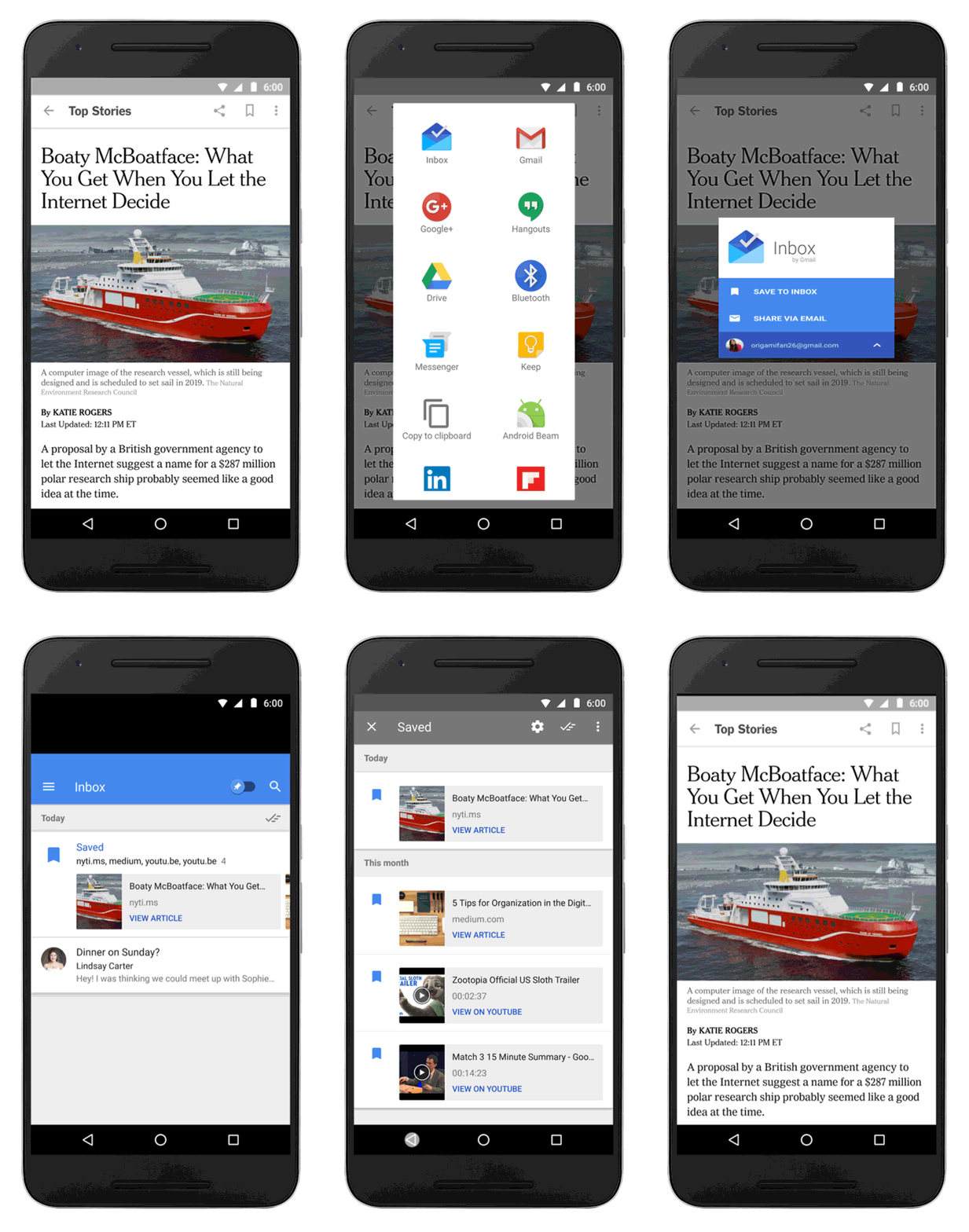
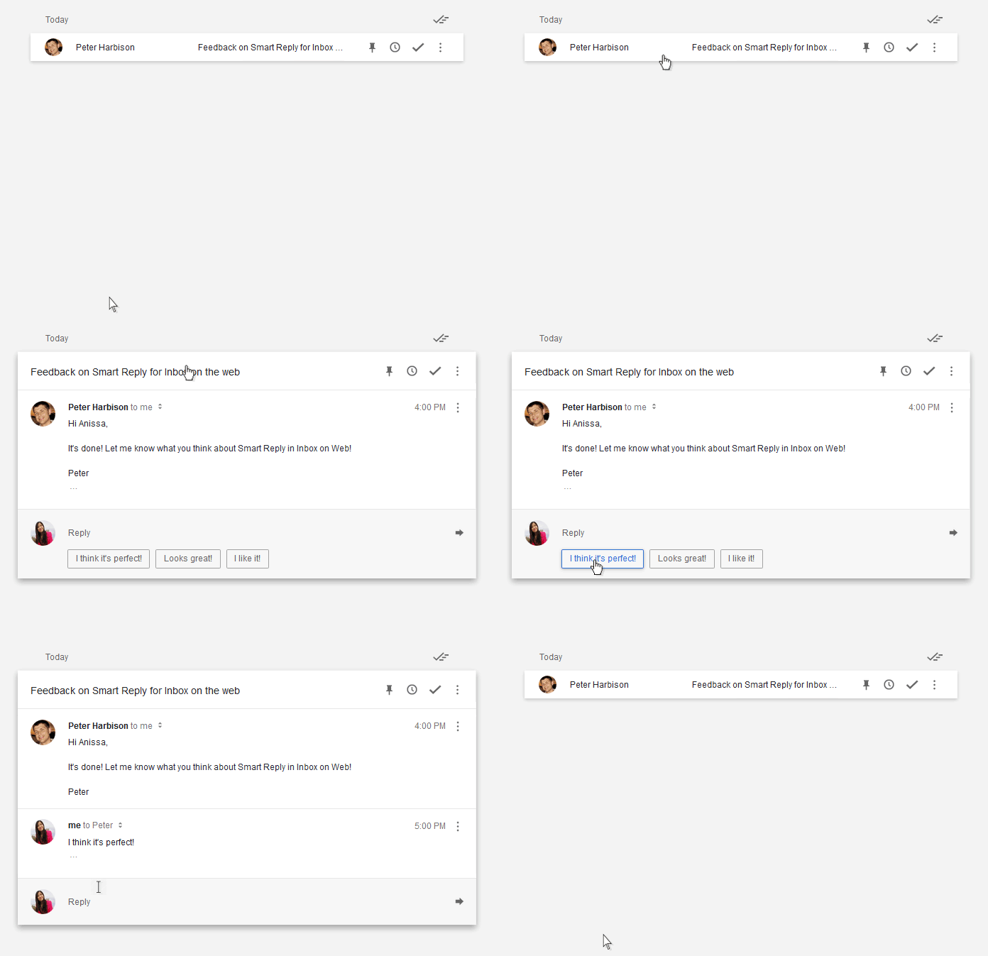
Last fall, Google launched Inbox by Google, a new email app, which it hopes will one day replace Gmail as the email experience people like to use. Right now, it’s still only available by invitation, but eventually it’s going to be available to all. It remains to be seen whether or not one day it’s forced on Gmail users.
It’s hard to say how well Inbox will be received by the masses. I tried it fairly early on, and wasn’t particularly comfortable with it. Others feel the same way, but some do find it to be an improved experience. It all comes down to preferences.
The last time Google made a big change to its email offering (the big Gmail redesign with the tabs), it had made some changes that had a direct effect on marketers. Reactions were mixed. Email marketers will, of course, have to pay attention to what Google does with Inbox as well.
Inbox Explained
First, let’s recap what Inbox does exactly.
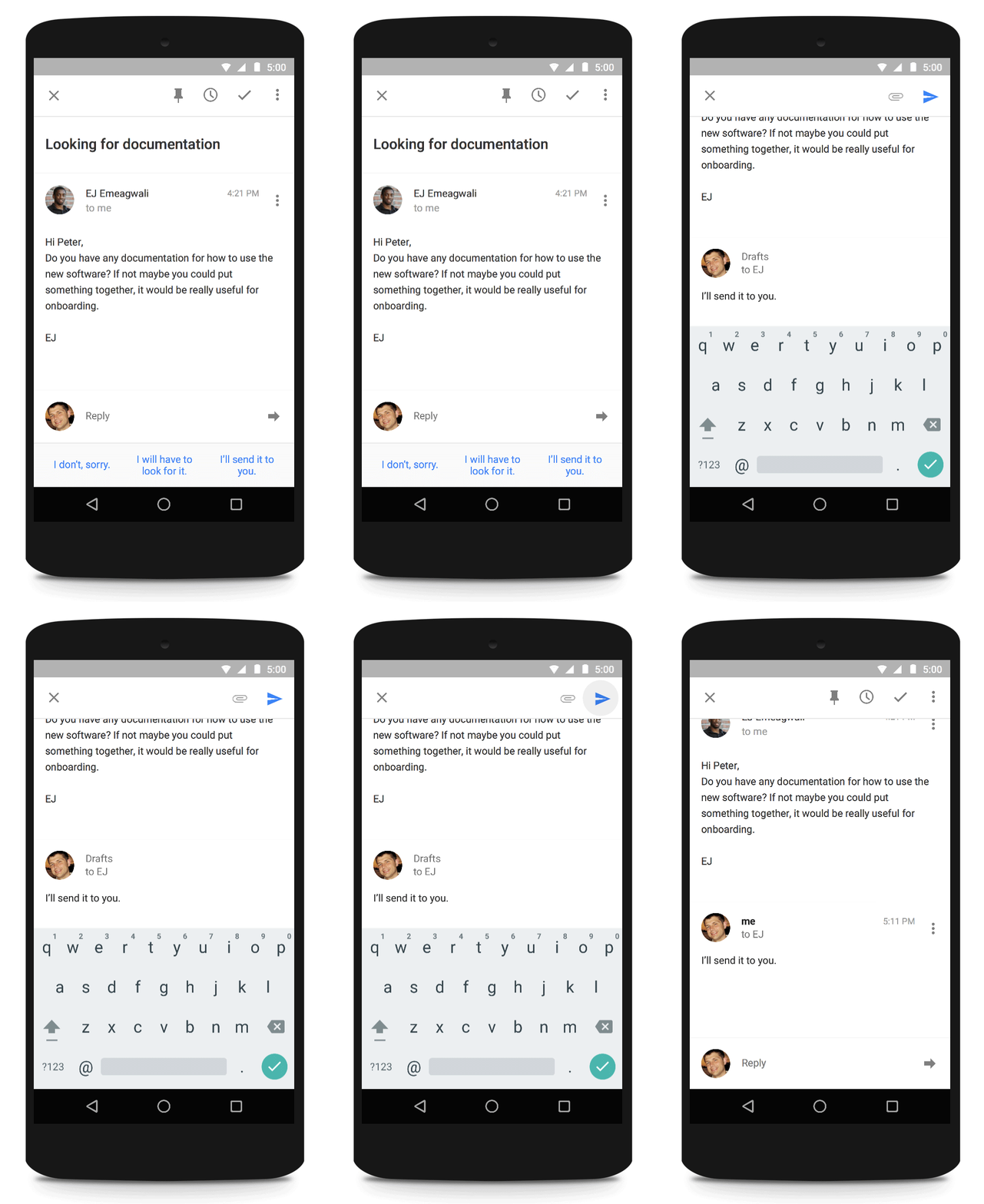
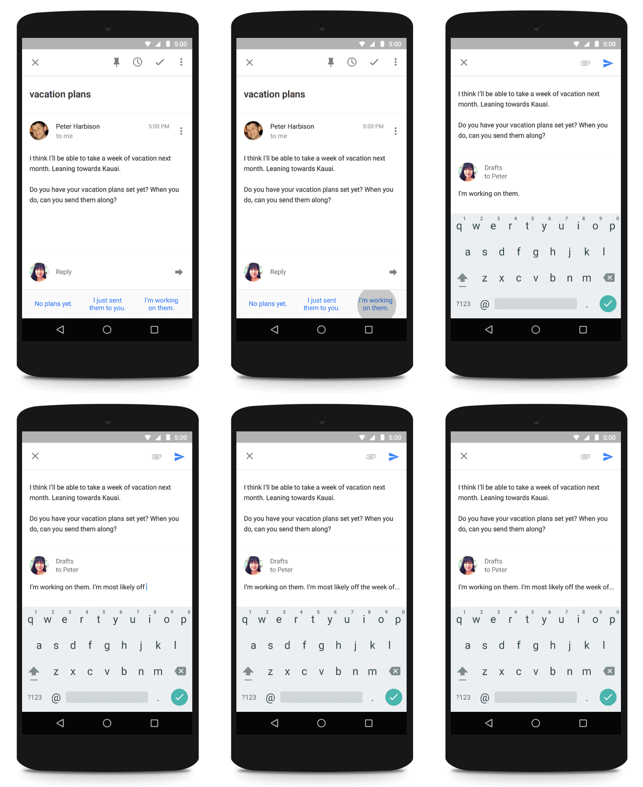
“Inbox expands upon the categories we introduced in Gmail last year, making it easy to deal with similar types of mail all at once,” explained Google’s Sundar Pichai when announcing the product in the fall. “For example, all your purchase receipts or bank statements are neatly grouped together so that you can quickly review and then swipe them out of the way. You can even teach Inbox to adapt to the way you work by choosing which emails you’d like to see grouped together.”
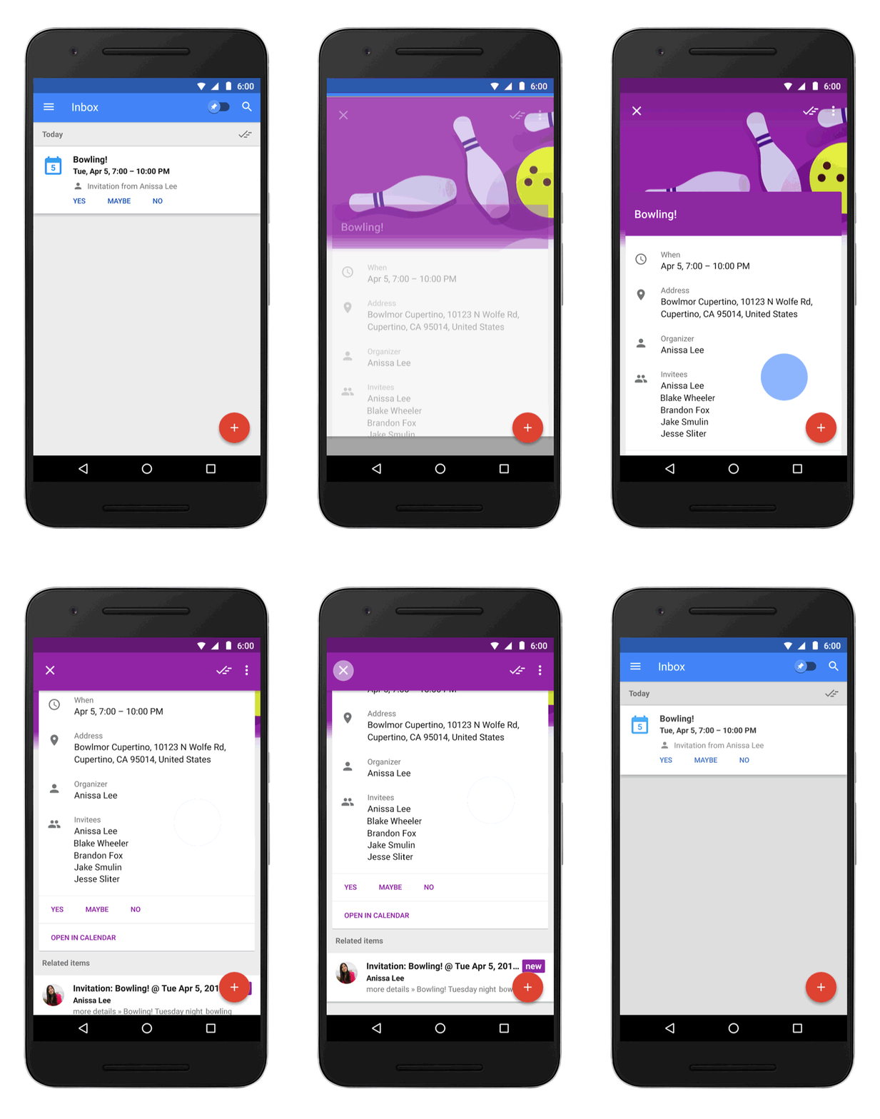
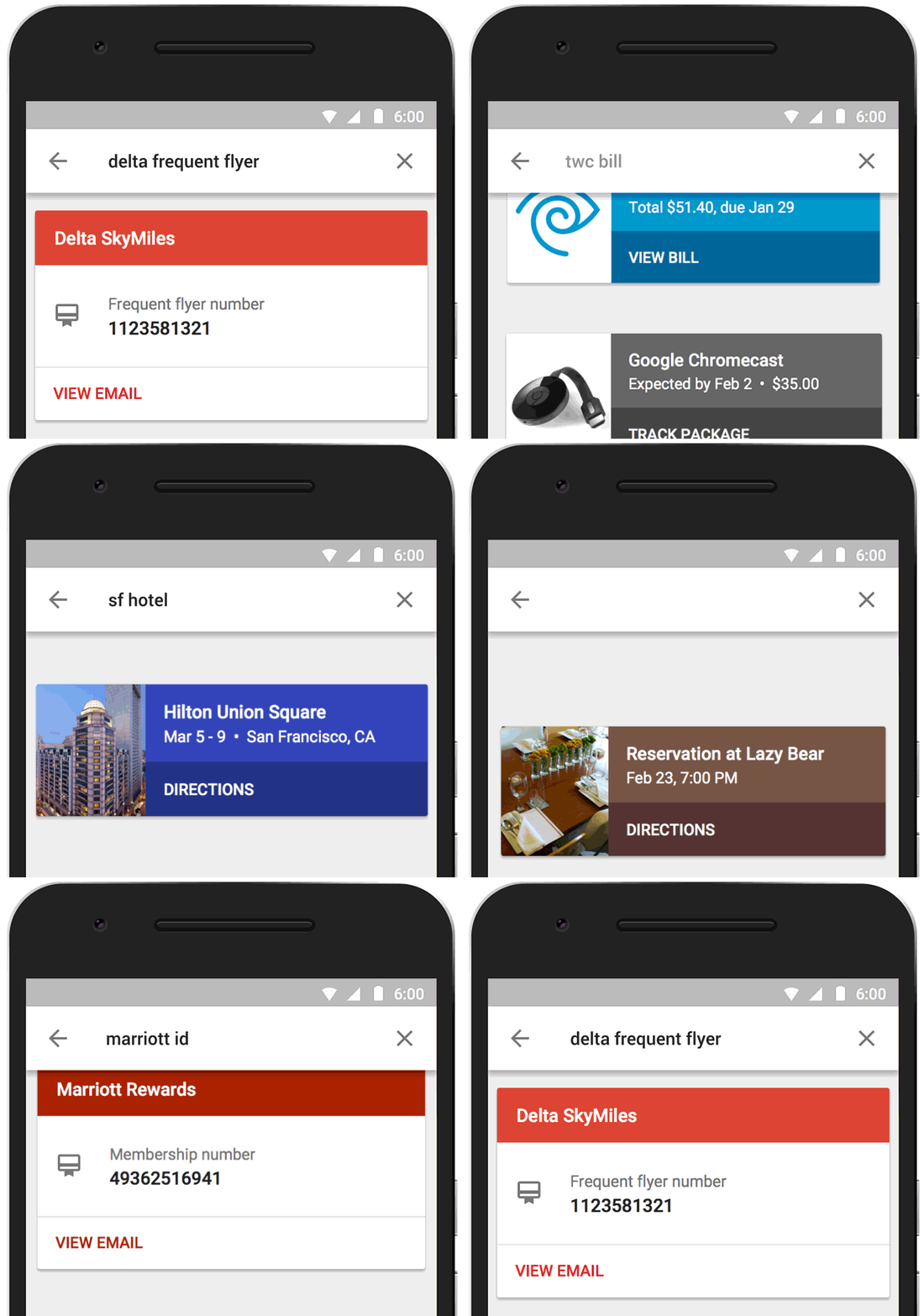
“Inbox highlights the key information from important messages, such as flight itineraries, event information, and photos and documents emailed to you by friends and family,” he added. “Inbox will even display useful information from the web that wasn’t in the original email, such as the real-time status of your flights and package deliveries. Highlights and Bundles work together to give you just the information you need at a glance.”

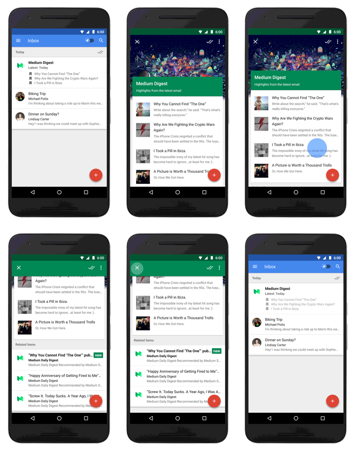
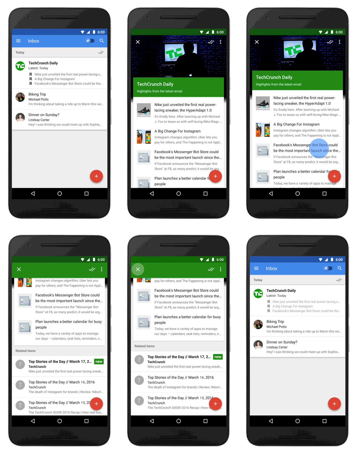
Bundles group together things like promotions, purchases, or trip information, so related messages are kept together in one place. Users can tell the app which messages they’d like to see grouped together and when they appear in the inbox (as they arrive, once a day, once a week,etc.).
Google tells users to try setting promos and social bundles to once a day so they can “focus on other messages first.”

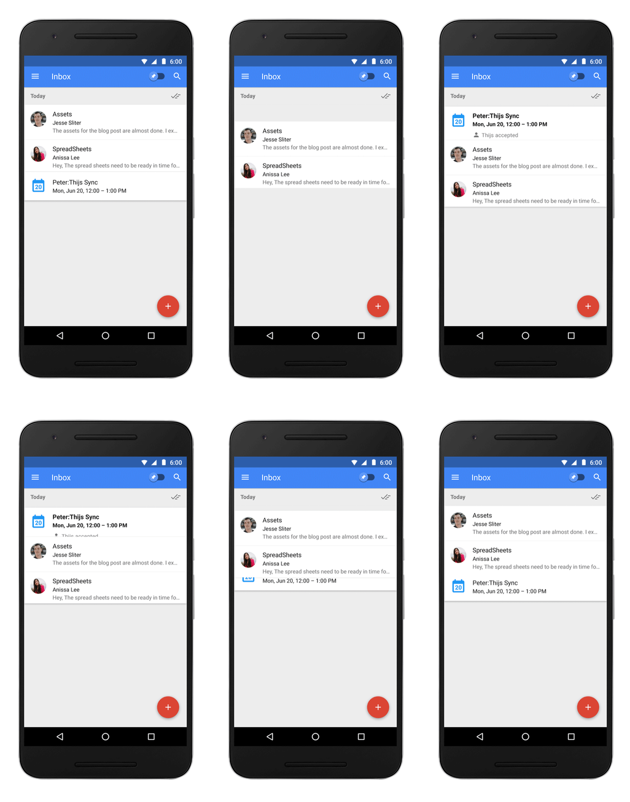
Inbox also lets you add reminders. Google describes it as “a centralized place to keep track of the things you need to get back to.” It also provides “Assists,” which are described as “handy pieces of information you may need to get the job done.”

“For example, if you write a Reminder to call the hardware store, Inbox will supply the store’s phone number and tell you if it’s open,” explained Pichai. “Assists work for your email, too. If you make a restaurant reservation online, Inbox adds a map to your confirmation email. Book a flight online, and Inbox gives a link to check-in.”
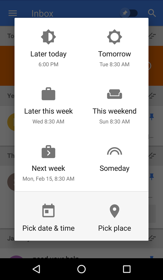
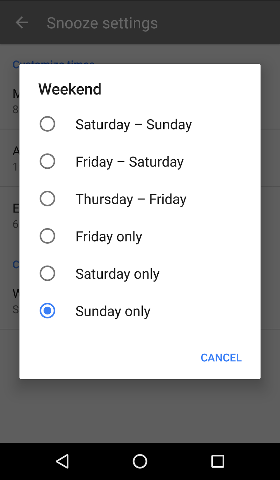
There’s also a snooze option for emails and reminders. You can temporarily dismiss them, but have them come back later.

Users can use Google Now or the new Google Calendar app to set reminders, which will then later appear in Inbox. Any reminder snoozed to a specific day will also appear on your calendar.
You can actually snooze emails to places rather than times.
“For example, you might want to snooze your ticket to the game, a reminder to buy milk to the grocery store, or even the article Mom sent you to when you get home,” says Inbox interaction designer Xander Pollock.
What Does Inbox Mean for Marketers?
Many in the email marketing industry have already offered some thoughts about how marketers can prepare for Inbox adoption.
Tom Sather, senior research director of email research at Return Path, suggests starting by displaying your logo as the From: Address. He notes that the visual style of Inbox displays senders by icons rather than plain text, similar to Gmail’s Grid View. To take advantage, you need a verified Google+ business account, authenticate with SPF and DKIM, and register with Google.
Sather also suggests optimizing for snooze and monitoring Inbox placement and categorization. On Snooze optimization he suggests providing Gmail users with instructions on how to snooze a message based on geolocation, if you have a brick and mortar location, and also proving your nearest location.
He also points out that the spam folder is harder to find than in Gmail, and users will likely miss more emails that are delivered there. This means potentially lower open rates and a greater need to increase Gmail deliverability.
Back to the visual style of Inbox for a moment. Aaron Beashel at CampaignMonitor suggests utilizing markup to add images and other things.
“Today, the inbox is very text-focused and only shows plain-text fields like the from name and subject line. Even the preheader is just plain text,” Beashel says. “With Highlights however, email marketers can use the Schema.org markup to add images, offers, actions and more to emails and they are displayed in the inbox itself.”
“These extra visuals in the inbox draw the reader’s eye to your email and can help it get noticed and opened,” he adds. “A similar thing happened when Twitter started showing images in the Twitter feed – tweets with images saw 18% more click-throughs than those without images as they stood out above the other content being presented to the user.”
“Just like with Tabs, Bundles will likely further polarize a subscriber’s engagement,” said Saleforce Marketing Cloud’s Chad White in a ClickZ article. “So if they were marginally engaged before, Bundles will make them less so. But if they were engaged before, Bundles will make them more so. On net, this should benefit most marketers, just like Tabs benefited most marketers, especially those with highly engaged subscribers.”
“That’s because Bundles, just like Tabs, makes it easier for email users to ignore emails that are unimportant to them and to pay more attention to the emails that are important to them,” he added. “Also, when similar emails are grouped together, it’s more efficient for users and better for marketers. I compared Gmail’s Promotions Tab to a shopping mall, saying that you’d rather have your store in the mall where people go to shop than in the Primary Tab where you’re like a traveling salesman who interrupts conversions with your subscribers’ friends and family members. Bundles are similar, except this mall floats freely in your inbox feed rather than being tethered to a tab.”
White also discussed Inbox in an Exact Target blog post, noting that the impact of Inbox on marketers will be gradual due to the invite-only launch and the fact that users will still have to download it even when it becomes generally available. It’s not like the tabbed interface in Gmail, which was just thrust upon users.
Kevin Gates at OptinMonster is recommending a five-step approach to optimizing for Inbox consisting of split tests, personalization, testing link counts, asking users to switch you to their lists, and segmentation. He gives an example of a message that marketers might consider using:
“Thank you for signing up! You will receive a confirmation email from us shortly. Please check your email (and possibly your SPAM folder) in the next few minutes so you can start receiving great tips straight to your inbox today!
Are you a Inbox by Google user? Click Here for further instructions for how to optimize your viewing experience with Google’s new app.”
We saw a lot of this type of thing when Gmail got the tabbed interface, so we’ll probably see it a lot too as Inbox gains more users.
So What Do People Think Of Inbox?
JR Raphael at ComputerWorld used Inbox for six weeks, and decided to go back to Gmail. He lists a whole bunch of Gmail features that just aren’t present in Inbox and calls it “pretty-looking but less practical and efficient” for his needs.
UserTesting recently conducted a study looking at how users interact with Inbox the first time they use it on a smartphone, and then on a desktop computer. It observed four different people. Hannah Alvarez highlighted five main takeaways about how they felt about the product: Users really appreciated the consistent experience between mobile and desktop; Some interactions were different on mobile, and that’s a good thing (mostly); The users had mixed feelings about the app doing a lot of work for you; Inbox makes some bold—and risky—assumptions about the icons it uses; Some people just don’t like change.
“Of the four participants, one user said she might use Inbox sometimes, and one said yes (When we followed up two weeks after the test, both told us that they were still using it),” says Alvarez. “The other two participants said they wouldn’t continue using Inbox. They both pointed out that the regular Gmail app already does a pretty great job of doing everything they need it to do. They can use the Social and Promotions tabs to reduce clutter, and they can install Boomerang if they want to return an email to their inbox at a later time. To them, the new interface in Inbox was just too much of a change. As one said, ‘If it ain’t broke, don’t fix it.’”
But Google will probably continue trying to fix it, and one day, users may not even have the option of using the old Gmail any longer. Who knows?
Google sent out a new round of Inbox invites last week.
