WebProNews

Tag: Fonts

  • Your iPhone, iPad, and Mac Font Is Likely Going to Change

    Are all the Apple users ready for a font change? Everyone loves a font change!

    Love it or not, a new look might be coming to your iOS and Mac OS devices.

    9to5Mac‘s Mark Gurman quotes the ubiquitous sources with knowledge of the situation, who say that when Apple unveils its new operating systems iOS 9 and OS X 10.11, you can say goodbye to Helvetica Neue.

    An you can say hello to San Francisco – the Apple-designed font that it currently uses on the Apple Watch (and the new MacBook keyboard).

    Apple has had Helvetica Neue on iPhones since the iOS 7 redesign, and on OS X since Yosemite last year. Not everyone thinks Helvetica Neue is the best choice.

    Apple says it has designed San Francisco “specifically for legibility”

    “The system font was designed specifically for legibility on Apple Watch. At large sizes, the font’s slightly condensed letters are set tight to take up less horizontal space. But at small sizes, they are spaced more loosely and have bigger apertures in glyphs like a and e to make these easier to read at a glance. Punctuation is also proportionally larger when the font gets smaller,” says Apple.

    Furthermore, “above all, text must be legible. If users can’t read the words in your app, it doesn’t matter how beautiful the typography is.”

    Anyway, we’ll likely see this shift at Apple’s WWDC on June 8, when Apple is set to unveil its new operating systems.

    Images via Apple

  • Garamond Typeface Can Save US Millions, Says Teen

    Could something as little as changing what font it uses on documents save the US Government millions of dollars each year? Yes, says student Suvir Mirchandani.

    The 14-year-old discovered his findings when he decided to look for ways to cut waste and save his Pittsburgh-area middle school money.

    As part of a science project, the sixth grader decided he was going to investigate if there was a better way to manage the paper and ink used on the many handouts students receive everyday at Dorseyville Middle School.

    Mirchandani studied a selection of random handouts collected from his teachers and found that the letters e, t, a, o, and r were the most commonly used characters. He charted how often the letters were used in four different typefaces: Garamond, Century Gothic, Times New Roman, and Comic Sans. He then went on to measure how much ink was used when creating each letter, with the help of a commercial tool called APFill Ink Coverage Software.

    The student then enlarged the letters, printed them on cardstock paper, and cut them out and weighed them to see which was the heaviest. He performed three different trials, and found that Garamond used the least. Thanks to its thinner strokes, this font could reduce its ink consumption by 24 percent, saving the school as much as $21,000 each year.

    Mirchandani submitted his findings to the Journal for Emerging Investigators, a publication founded by a group of Harvard grads. The JEI was so impressed with the student’s work, the staff challenged him to investigate if the font change would save money for the federal government.

    Mirchandani discovered that if the federal government used Garamond exclusively, it could save nearly 30 percent, or $136 million per year. If state governments used the font, an additional $234 million could be spared.

    Although Gary Somerset, the media and public relations manager of the Government Printing Office is quite impressed with the student’s findings, it is unclear whether the change will be made.

    Image via YouTube

  • Google Web Fonts Now Helps You Find Alternatives

    Google doesn’t pretend to have every font you might want available in Google Web Fonts. Now, they’re pointing you to alternative sources when they don’t have what you’re looking for.

    In a brief post the the Web Font Blog, Google software engineer writes:

    We know that finding the right font for your website or blog is a personal choice, and there are many great fonts available to choose from on the web. Now when you search for a font that isn’t available on Google Web Fonts, we show you additional fonts available from Monotype. Each result is shown in the actual font so you can easily preview your options. To get more information on a font, simply click the link under it’s name.

    Google Web Fonts

    Google says it is working to add results from more web font providers in the future.

  • Source Code Pro: Adobe’s New Fonts For Coders

    Source Code Pro: Adobe’s New Fonts For Coders

    Adobe announced a lot of new Web development tools today at its Create The Web keynote. The company hopes developers and creators will use its newly Edge tools to push the Web forward. Two of the Edge tools announced today were Edge Web Fonts and Typekit, both of which feature open source fonts. Joining the launch of these tools, Adobe is also releasing new open source fonts.

    Adobe announced today the release of its second open source typeface family, Source Code Pro. The new monospaced typeface family was designed by the Paul Hunt and the Adobe Type team. He based his work on the previously released Sources Sans Pro.

    Hunt says that the design of Source Code Pro was inspired by his own desire to have a “coding font that [he] would want to use [himself].” He goes on to say that he had to adapt his design to avoid the problems that usually plague monospace text. Most of the work went into differentiating characters that looked similar to one another. He also worked to make the letters and numbers flow without tiring the eyes of coders.

    Unfortunately, he will not be able to release bitmaps for the new fonts. He felt that it was more prudent to target rendering antialiased rendering environments since so much work is done on devices that feature Retina Displays, Clear Type and other font smoothing options.

    As with all open source projects, the new Source Code Pro fonts are available for free. you can get them right now at Adobe’s SourceForge page. Adobe also encourages developers and designers to clone and fork the project on GitHub. The fonts are also available on various Web portals like Edge Web Fonts, TypeKit and Google Web Fonts.

  • Zuckerberg’s Sister Now Part Of YOLO Meme, Following Google’s Wildfire Acquisition

    Google acquired Wildfire this week. It’s a social media marketing platform company, but Google also snagged a couple of Zuckerbergs along with the rest of the team. One is Facebook CEO Mark Zuckerberg’s sister Arielle, and the other, while not technically a Zuckerberg, is in Zuck’s family as well. That would be Harry Schmidt, who’s married to another of Mark’s sisters.

    With Google and Facebook becoming increasingly competitive over the years, it makes for a fun situation for onlookers. Arielle, who was actually away in Israel when the announcement came out, is having some fun with it as well.

    In the comments of one of her Facebook posts, she shares a link showing that she has now become part of the YOLO (You Only Live Once) meme, thanks to the acquisition. The link was to the What Should We Call Social Media Tumblr, who posted the following GIF with the caption: “When Google Acquired Wildfire”.

    Arielle Zuckerberg: YOLO

    Ariel from the Little Mermaid. Get it?

    “This is hilarious,” Arielle Zuckerberg said, sharing the link with her Facebook followers.

    Earlier in the conversation, Schmidt noted, “We’ll be awkward together, it’ll be totally awesome.”

  • How Google Handles Font Replacement

    How Google Handles Font Replacement

    Google’s Matt Cutts put up a new Webmaster Help video, discussing how Google handles font replacement. The video was created in response to a user-submitted question:

    How does Google view font replacement (ie. Cufan, SIFR, FLIR)? Are some methods better than others, are all good, all bad?

    “So we have mentioned some specific stuff like SIFR that we’re OK with. But again, think about this,” says Cutts. “You want to basically show the same content to users that you do to Googlebot. And so, as much as possible, you want to show the same actual content. So we’ve said that having fonts using methods like SIFR is OK, but ideally, you might concentrate on some of the newer stuff that has been happening in that space.”

    “So if you search for web fonts, I think Google, for example, has a web font directory of over 100 different web fonts,” Cutts says. “So now we’re starting to get the point where, if you use one of these types of commonly available fonts, you don’t even have to do font replacement using the traditional techniques. It’s actual letters that are selectable and copy and pastable in your browser. So it’s not the case that we tend to see a lot of deception and a lot of abuse.”

    “If you were to have a logo here and then underneath the logo have text that’s hidden that says buy cheap Viagra, debt consolidation, mortgages online, that sort of stuff, then that could be viewed as deceptive,” he adds.

    In fact, that’s exactly the kind of thing that can get you in trouble with Google’s Penguin update, even if Google doesn’t get you with a manual penalty. To avoid this, here’s more advice from Google, regarding hidden text.

    “But if the text that’s in the font replacement technique is the same as what is in the logo, then you should be in pretty good shape,” Cutts wraps up the video. “However, I would encourage people to check out some of this newer stuff, because the newer stuff doesn’t actually have to do some of these techniques. Rather, it’s the actual letters, and it’s just using different ways of marking that up, so that the browser, it looks really good. And yet, at the same time, the real text is there. And so search engines are able to index it and process it, just like they would normal text.”

  • Google Goes Font Crazy, Adds 450 To Google Docs

    Tired of Arial, Times New Roman and Courier? Google wants to spruce up your documents with 450 new fonts. “Often the best way to get your point across is to present your idea in a creative, captivating way,” they say in a blog post. “Today, we added over 450 new fonts to Google documents to make it easier for you to add a little something extra to whatever you create.”

    Fun. Luckily, your font menu within Google Docs wont have all 450+ fonts listed, as that would be simply overwhelming. All you have to do is click “add fonts” within the font menu dropdown. There, you’ll be taken to Google’s web font database where you can select which new fonts you want to add to your menu.

    450 new fonts google docs

    In the Google Docs blog post, they also detail some of the updates from the month of April that you may have missed. First, inserting images into your documents has gotten a little better. Now you can insert images directly from Google Drive, straight from the LIFE photo archive, as well as photos from your webcam.

    Not only that, but there are now 60+ new templates available in the gallery.

    Google has really been busy improving Google Docs as of late. In March, they made PDFs and Image text searchable, and they also added Google search spell check support. Google Docs also became a core part of Google+ Hangouts recently, a move that is sure to be popular in offices everywhere.

    All of these improvements and integrations are part of the company’s “Go Google” campaign that centered around the launch of their Google Drive cloud storage service. The collaborative editing feature was the focal point of this amazing web ad starring Hall and Oates:

  • The Comic Sans Project Promises To Defend Everyone’s Favorite Font

    The Comic Sans Project Promises To Defend Everyone’s Favorite Font

    One time, during a fairly boring lecture in one of my unremarkable college courses, something amazing happened. My professor put up the title page from a student’s essay and began mercilessly berating said student for one simply failure.

    They used Comic Sans.

    Of course the name was blacked out and nobody could possibly know which student had committed the unforgivable act – but they knew. They laughed with the rest of the class, but inside they felt all-encompassing shame of poor font choice.

    Popular opinion holds that Comic Sans is the worst typeface to ever exist. Narrowly edging Papyrus for that dubious distinction, Comic Sans is a force of nature. It can inspire so much raw hatred, allowing it to unite people around a common enemy. Folks that can’t agree on which direction the sun rises find common ground in their overwhelming disgust for Vincent Connare’s simple, comic book-inspired font.

    But like almost anything universally despised, there are a few brave souls who have decided to stand in defense of the maligned font. The people of the Comic Sans Project state “we are the Comic Sans defenders. We fear no fonts and we will make the whole world Comic Sans. Because Helvetica is sooo 2011.”

    The tumblr is simple. To spread Comic Sans to everything we know and love by replacing classic logos with the font. So far, they’ve managed about 10 revamps – as they’ve only been active for about a week. Here are a few of my favorites:

    They say that they have received a lot of submissions, and are working on setting up a submission system soon.

    I’m afraid what Hitler might have to say about the blog, however:

    The people at the Comic Sans Project aren’t the first to take up the cause of the beleaguered font. This amazing animation was created based on a McSweeney’s monologue:

    Why so much hatred for Comic Sans? As one YouTuber said in a response to that very question: “Because it’s shit.”

    If all this Comic Sans has you feeling a little gross, might I suggest watching Helvetica as the mind’s equivalent of a long, hot shower.

    [Via The Daily What]

  • Blogger Drops New Fonts

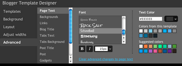
    With a move that can only be described as “sheer brazenness,” Google’s weblog service, Blogger.com, has introduced a feature that may just be the tipping point between order and chaos in society: the introduction of 35 additional fonts to their blog service.

    Perhaps “unleashing” captures the moment better than the word “introduction.”

    Facetiousness aside, these additional fonts obviously give users multiple options; and in a cyberworld overrun with Verdana and Arial text, a little variety goes a long way…

    Just ask Dan Gilbert.

    Besides the number of fonts introduced, Blogger boasts all of the new styles are web-safe, going as far to call them “Web Fonts.”  With the 35 new fonts, Blogger’s total is now up to 77, all of which are listed here

    Incidentally, Comic Sans is not one of the available fonts, so the next time Dan Gilbert wants to write a fiery dismissive of LeBron James (image H/t), he should probably look into Blogger’s service.

    Blogger WYSIWYG

    The new fonts are available for all Blogger users, and the text alterations can be applied to an  entire blog.  Members are encouraged to experiment in the composition WYSIWYG before applying any blog-wide changes.


  • Google Adds Web Font Support to Google Docs

    Google Adds Web Font Support to Google Docs

    Google announced today that Google Docs now supports web fonts using the Google Font API. To start off, there are six new fonts available.

    "This is just the beginning of fonts in Google Docs," says software engineer Jeremie Lenfant-Engelmann. "We added six new fonts today and we’re already testing our next batch. You’ll see many more new fonts over the next few months. And because Google Docs uses web fonts, you’ll never need to install a new font: when you load your document, the latest set of fonts will always be there, ready to use."

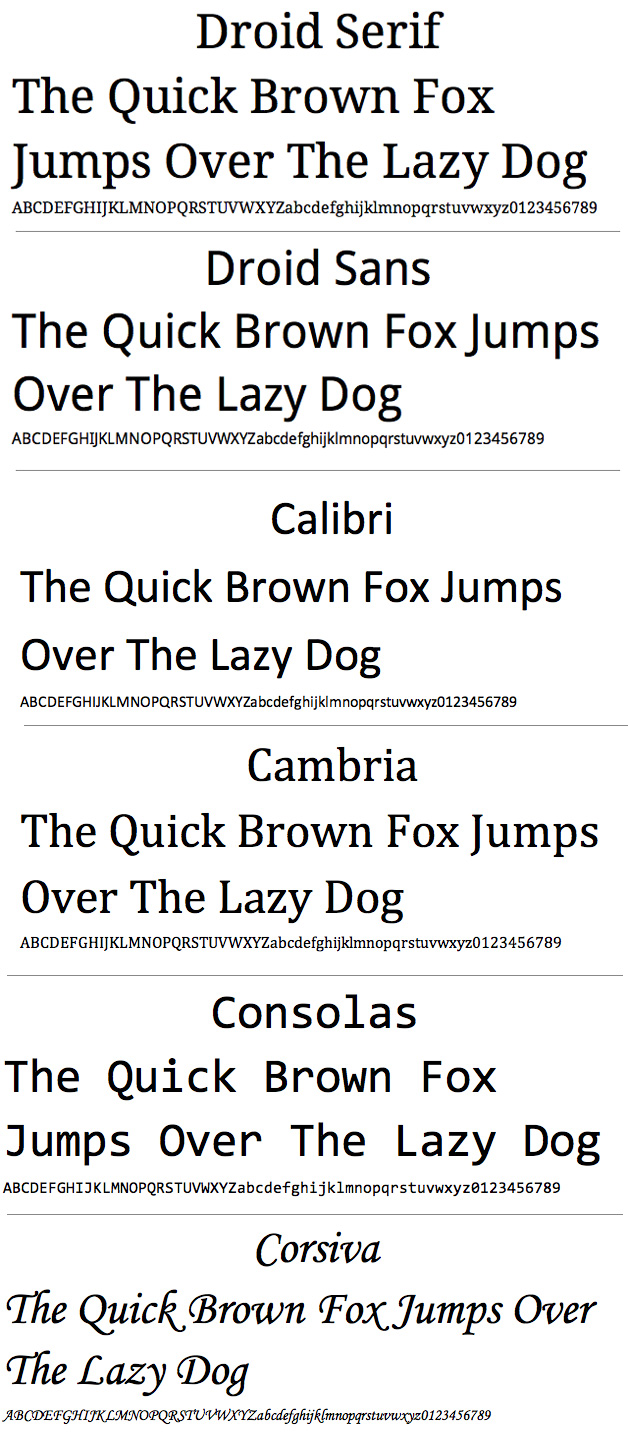
    The six new fonts include: Droid Serif, Droid Sans, Calibri, Cambria, Consolas and Corsiva. "Right now our font support covers most Latin and Western European character sets. However, we’ll be adding web fonts for other languages (like Hebrew and Greek) soon.," says Lenfant-Engelmann.

    Google Docs Fonts

    Google is doing a lot of new things with Google Docs. These include new collaboration features and spreadsheet printing. Google announced this week that 3 Million Businesses Have "Gone Google".

  • Google Launches New Preview Feature for Font Directory

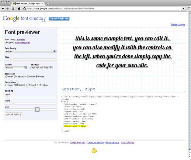
    Google has launched a new feature for its font directory that lets users preview fonts and generates code to use them. The font directory contains fonts that are part of Google’s font API.

    "Now, whenever you visit the font family page of any of the fonts, you will see a link saying ‘Preview this font’ that will load your font selection into the font previewer," says Marc Tobias Kunisch with the Google Font API Team. "Here you can edit the text, change its size and line height, and add decorations and spacing among other things. You can even apply text shadow to your text."

    Google Font Previewer launched

    The preview will then generate code that you can stick in your style sheet.

    "If you want to see the font sample without any distractions from the font previewer controls, you can do that as well simply by clicking ‘Toggle controls’ in the upper right corner," notes Kunisch. "This will show you a nice clean example of what the font would look like in your design."

    The Font API (in beta) lets users add web fonts to any web page.