If there’s some good that comes from the kind of natural disaster that hit Japan, aside from seeing people put aside their petty differences for a moment in favor of assisting those in need, it’s seeing Internet technologies being used as a tool that both educates those who are unaware about the extent of the disaster, and, in some cases, as a tool that assists with relief efforts.
One technology in particular, online maps, has proved to be a powerful tool, thanks in large part to the flexibility and the allowance of user-generated content, either in the form of educational mash-ups and/or the use of crowdsourcing to provide these maps with as much accurate data as possible. Considering the concept behind crowdsourcing — “the act of outsourcing tasks… to an undefined, large group of people or community (a “crowd”)” — and the ease-of-manipulation these maps offer, much of this crowd-produced data is done in real time.
Take, for instance, the Haiti earthquake and the subsequent OpenStreetMap collaboration that, very quickly, produced an accurate post-earthquake map of populated areas that was actually used by disaster relief workers. This is a perfect example of just how helpful technology can be while dealing with the effects of a devastating natural disaster.
While it’s true that Japan’s technology infrastructure is in much better shape than Haiti’s; one’s a third-world country, while the other is considered a technological super power, the Tōhoku earthquake left a sizable need for updates to Japan’s geo-map offerings. Clearly, these user-generated maps are becoming more and more useful, if, for nothing else, providing an accurate before-and-after picture of the disaster area.
Because of the fear related to the nuclear power plants affected by the Japanese earthquake of March 11, one such geo-map mash-up, as detailed by Boing Boing, focuses on monitoring the radiation levels of the locations these plants are housed in.
Over at RDTN.org, there’s a Google map of Japan that derives its data from user-generated content, or in this case, crowdsourcing. Users are invited to take and post a reading, provided they have new information to offer. The map is complete with placemarkers that use different colors than Google’s default setting (blue) in order to differentiate their content.
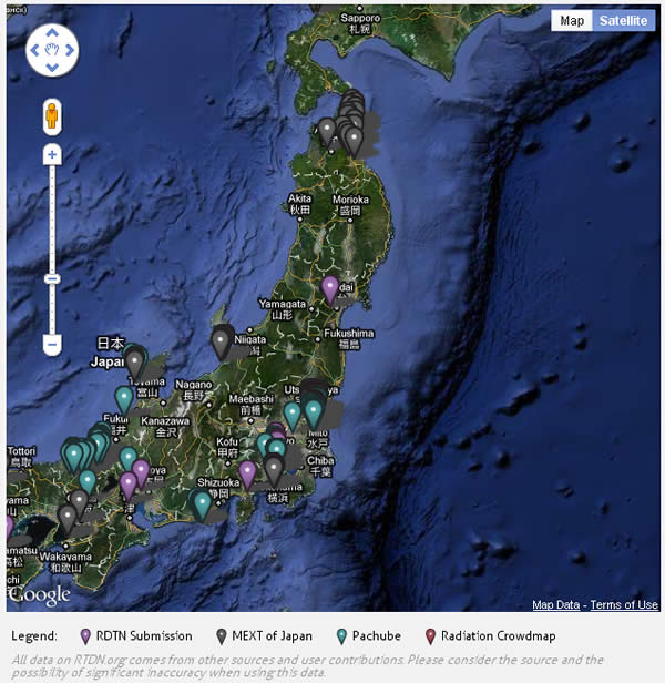
Another map, called the
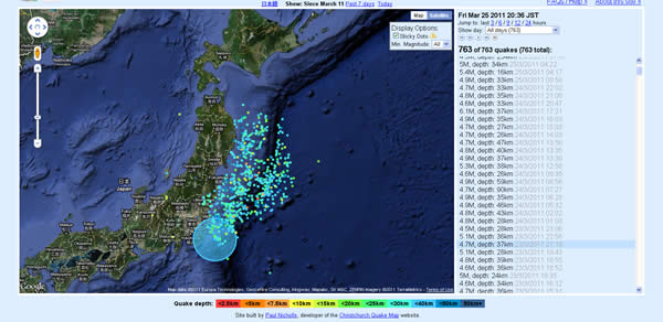
Japan Quake Map, is an awfully revealing look at the area in question. This particular mash-up shows just how many different earthquakes have hit the area since March 11, the day the “big” one hit Tōhoku. The results are quite surprising and it shows that, even though they may not cause the destruction the “big one” did, the Japanese proper is constantly being bombarded with earthquakes.
Since March 11, there have been over 700 earthquakes in and around Japan and the tectonic plate boundary the island resides on. While most, if not all, of these “other” quakes are indeed smaller on the magnitude scale, the fact there’s been so many is frightening. Apparently, as long as you keep the Richter reading below the six level, it’s just another day in the life of living on the tectonic plates that make up Japan.
As a comparison, here’s what a earthquake with a magnitude of 4.7 looks like on the map:
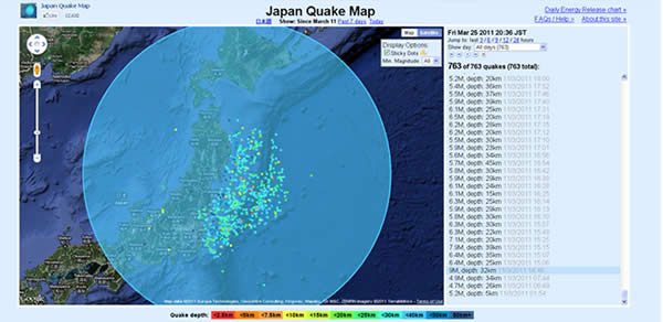
And now here’s what the Tōhoku earthquake looked like. According to the mash-up, this particular quake registered in at a magnitude of 9. As you can see, the difference between this and the above image is staggering:
While it’s often difficult, if not impossible, to find the good in such natural disasters, in a world of
pathetic scammers trying to make a buck off of Japan’s misery, it’s almost inspiring to see the potential of the Internet being put to good use for a change.


 “American education has been the best in the world, but we’re falling below our own high standards of excellence for high school and college attainment,” said Bill Gates, co-chair of the Bill & Melinda Gates Foundation.
  Unfortunately, neither Google nor anyone representing New York estimated how much money this move might save the school system, but in any event, this could act as a catalyst for getting other states to embrace Google Apps.
 "I’m excited to start this new project," he says. "I’ve been very lucky to have the education and opportunities I’ve had in my life and I look forwarding to participating in giving the 40,000+ students in Newark the same opportunities. Together, we can support a bold and thoughtful program for improving education, starting by making Newark a symbol of excellence."