WebProNews

Category: Developer

App Development, Web Design & Web Development News

  • Siri Bypasses Your iPhone Passcode, By Default

    People enable passcode locks on their mobile devices for a wide variety of reasons. Maybe they want to keep a snooping boyfriend out of their recent calls list, or maybe they fear what might happen if they lost their phone and a stranger could browse their photos with ease. Lots of people nowadays have personal banking apps the could be accessible to anyone with access to the phone.

    But it looks as though in some circumstances, the new iPhone 4S voice assistant Siri can bypass your passcode and allow anyone to perform tasks on a locked phone.

    Sophos’ Naked Security blog stumbled upon this eccentricity of the new iPhone 4S, and the claim’s veracity has been confirmed by this writer.

    By default, you can use Siri to make phone calls, check your calendar, send texts and emails (to people in your contacts list) and set reminders, even when your phone is locked with a passcode. There are some things that you can’t do, like interact with apps.

    Of course, this is handy for the owner of the phone – not having to enter a passcode for everything they want to do. But it’s a nightmare for the owner if the phone fell into the wrong hands. Imagine your friends getting a hold of your iPhone and texting your ex-girlfriend…yikes.

    All kidding aside, it’s a fairly significant security flaw to be the default setting on the Apple device. Luckily, it’s quite easy to fix by going to Settings > General > Passcode Lock and toggling off Siri functionality while lock is enabled.

    But plenty of users won’t think to do this, and it’s just curious that Siri is able to do so much on a passcode-locked phone by default.

  • Google Buzz Gets Killed, Along with Code Search, Jaiku, iGoogle Social Features

    When Google launched Google+, it didn’t take long for some of us to speculate about the demise of Google Buzz. Now, we don’t have to speculate much more because Google has come out and said they’re shutting it down, along with a few other services.

    “In a few weeks we’ll shut down Google Buzz and the Buzz API, and focus instead on Google+,” says Google VP, Product Bradley Horowtiz in a blog post. “While people obviously won’t be able to create new posts after that, they will be able to view their existing content on their Google Profile, and download it using Google Takeout.”

    “Changing the world takes focus on the future, and honesty about the past,” he says. “We learned a lot from products like Buzz, and are putting that learning to work every day in our vision for products like Google+. Our users expect great things from us; today’s announcements let us focus even more on giving them something truly awesome.”

    The other services Google is shutting down include: Code Search, Jaiku, iGoogle’s social features and the University Research Program for Google Search. These will all be shut down on January 15.

    iGoogle itself, and non-social iGoogle apps will stay the same.

    Google is also officially closing the Google Labs site today, as previously announced. Boutiques.com and Like.com will be replaced by Google Product Search, also as previously announced.

    Will you miss any of the products Google is shutting down? Let us know in the comments.

  • Ripoff Report Strikes Back: Removes Code on Site Left by Hacker

    The Ripoff Report has struck back against the so-called reputation management companies that claim to be able to remove posts about companies on the RipoffReport.com website. In a recent press release, Ripoff Report claims that they have removed code on their website that was left by a hacker hired by reputation management companies.


    A sample advertisement claiming Ripoff Report removal is shown above.

    Ripoff Report explained what happened.

    “Earlier this year, a hacker, promising his customers “reputation management” services, had embedded code into the website to prevent search engines from recognizing certain postings. In some cases, website visitors were misdirected to a false message stating that the posting had been redacted.”

    Although the press release itself offers no specific proof of the fact that malicious code had been embedded onto the RipoffReport.com website, I am personally not surprised that something like this was done by a hacker. There are a lot of companies out there that would like negative reviews of their products or services removed from the Ripoff Report website. From what I can tell, the website only really exists in order to report negatives about a business, company, or individual. So, naturally, a website like that would have enemies.


    Another sample advertisement claiming Ripoff Report removal is shown above.

    If you search at Google for “remove ripoff report”, or a similar phrase related to getting a Ripoff Report removed, there are a lot of reputation management companies that claim that they can get a listing removed from the RipoffReport.com website. And some will even charge thousands of dollars to get the report removed from the website.

    Currently, however, according to RipoffReport.com, there is no way to completely get a negative review or negative post removed from the website. There is a way to respond with a rebuttal. The company says that “Once a company has been named in a consumer’s report, the company may respond by posting a rebuttal. Both reports and rebuttals are posted free of charge, and once submitted they are not removed. Before a report may be submitted, users are required to create an account by providing a valid email address and warrant that any report submitted is truthful and accurate.”

    If a search for your company name or your personal name in Google reveals a RipoffReport.com listing, you have a few options:

    – Respond by posting a rebuttal.

    – Hire a company or individual who has online reputation management experience that can help bring more positive web pages about your company towards the top of the search results. By emphasizing the positive, the hope is that the negatives are pushed down.

    I recommend that you stay away form any companies that claim they can completely remove postings from RipoffReport.com, as that does not appear to be the case.

    In a related story, you might recall that recently Ripoff Report removed themselves from Google, which was apparently only a mistake by the company. In one of my recent blog posts, I examined how removing your website from Google can help–or hurt–your search engine rankings.

    Check out billhartzer.com for more articles by Bill Hartzer

  • QR Codes and Mammograms: Better Health Through Technology

    If you ask most people, I’m sure that they would tell you that the health care field can greatly benefit from the rapidly growing tech sector. Whether it is better machinery, more organized record keeping or doctors having accessibility to things like iPads, new tech can change both medical research as well as medical practice.

    The Athens Regional Medical Center in Georgia is using a different technology to improve patient care in one small way.

    The hospital is using QR codes to help women schedule mammograms. The hospital has been inserting the little black-and-white boxes into their various forms of advertising, such as newspapers and magazines.

    When a woman uses her smartphone to capture the code, she is taken to the Athens Regional website where she can book her mammogram.

    Marketing manager Courtney Alford-Pomeroy has this to say about the campaign (as quoted at Athens Banner-Herald

    We felt that women in our community were looking for more convenience in accessing their health care…the QR code was a test to see how popular this is going to be in our market.

    The multiple-source approach to the QR code placement allows Pomeroy to see where their marketing is the most effective, whether that be magazines, newspaper ads or postcards.

    It came down to wanting to be able to track where people were reading about our services and pulling up our services on the website. I want to make sure that we’re targeting people in the places that are most convenient for them.”

    And just how successful have the QR codes in the ads been? Apparently the hospital has seen a 15% increase in the visits to the online mammograms form. Also, those who use the QR code to visit the online mammogram request site are more likely to actually schedule an appointment.

    Pomeroy said that she plans on using QR codes in their next “health and marketing campaign.”

    Do you think QR codes would increase the chance that you would schedule a procedure? Mammograms? Prostate exams? Even basic physicals? Let us know in the comments.

  • Adobe Edge Launched in Preview – HTML5 Flash-Like Web Design

    Adobe has unveiled a preview release of a new HTML5 animation tool that is designed to let web designers bring Flash-like content to sites using HTML, JavaScript, and CSS. It’s called Adobe Edge.

    The company says it’s adopting an open development methodology for Edge, so it is available earlier than usual in the development process. It’s been released through Adobe Labs. Users will be able to contribute feedback, and influence the final product.

    “Over the last year Adobe has delivered on several significant HTML5 milestones including contributions to jQuery, submitting code to WebKit, and enhanced HTML5 output in Creative Suite® 5.5,”said Paul Gubbay, vice president of Design and Web Engineering at Adobe. “Now, with Adobe Edge, we’re taking our HTML5 tooling to a whole new level and look forward to getting some really useful feedback from the community over the next few months, as we refine the product.”

    Adobe EdgeEdge Preview 1 is finally here! Create animated content using HTML5, CSS3, and JavaScript with a slick, easy to use timeline-based interface. Download it now for free on Adobe Labs.

    Adobe explains:

    The Adobe Edge preview works natively with HTML. It enables users to add motion to existing HTML documents without hampering design integrity of CSS-based layouts, and it also enables users to easily create visually rich content from scratch, using familiar drawing tools that produce HTML elements styled with CSS3. Users can import standard Web graphics assets such as SVG, PNG, JPG and GIF files and style them using CSS3. The design stage utilizes WebKit to enable design, preview and manipulation of content with incredible fidelity. The innovative timeline feature is both familiar for creative professionals and breaks new ground in animation productivity to enable users to define and customize motion applied to HTML elements with extreme precision.

    The content created with Edge is designed to work with modern browsers, including those on Android, BlackBerry PlayBook, iOS, HP webOS, as well as Firefox, Chrome, Safari, and IE9.

    Edge will be updated regularly to add new functionality, Adobe says. It’s free of charge for the preview version.

  • Adobe Buys EchoSign for Digital Signatures

    Adobe has acquired EchoSign, a provider of electronic signatures. All EchoSign full-time employees, as well as its founders, will join Adobe.

    Adobe says EchoSign’s solution will be a key part of its document exchange services platform. It will be integrated with Adobe’s SendNow, FormsCentral, and CreatePDF.

    “Adobe’s document solutions help organizations turn inefficient, paper-based workflows into streamlined electronic ones,” said Kevin M. Lynch, vice president and general manager of Acrobat Solutions, Digital Enterprise Solutions at Adobe. “By adding electronic signature capabilities to Adobe’s document exchange services platform, we will be addressing the need to provide better customer experiences by significantly reducing the time, cost and complexity associated with having a document signed.”

    On the EchoSign blog, CEO Jason Lemkin wrote:

    Together, our aim is to make electronic signatures the standard way for people to sign documents and automate contracting.

    Adobe’s PDF solutions and document exchange services platform have helped organizations turn inefficient, paper-based workflows – like overnight envelopes – into streamlined electronic ones.

    The EchoSign solution will be integrated with Adobe’s other document services including SendNow for managed file transfer, FormsCentral for form creation and CreatePDF for online PDF creation.

    With Adobe as your partner, you can look forward to ongoing innovation in electronic signatures and web-based contracts.We thank you for using the EchoSign service and sincerely appreciate your business. Together, we are excited to help shape the future of web-based contracting across businesses around the world.”

    So happy to welcome @echosign to @acrobatdotcom & @adobe family. Wait ’til you see what we do with e-sign! http://ow.ly/5GH65 8 hours ago via HootSuite · powered by @socialditto

    @abhic same team, same great product, just more resources 8 hours ago via TweetDeck · powered by @socialditto

    @dahowlett no, no plans to change any pricing, just grow even faster with more resources. freemium is a necessity. 7 hours ago via TweetDeck · powered by @socialditto

    @ODonoghueSteve worry not. same team, same commitment, more resources, more integration 7 hours ago via TweetDeck · powered by @socialditto

    Terms of the acquisition were not disclosed. EchoSign already has 3 million users.

  • Convert SWF Files to HTML5 with Swiffy

    Convert SWF Files to HTML5 with Swiffy

    Google just launched a new Google Labs project called “Swiffy“. It converts Flash SWF files to HTML5.

    It lets you reuse Flash content on devices without a Flash player (ie: iPhones and iPads).

    You may recall a similar tool from Adobe, called Wallaby. Here’s what Google has to say about that:

    Wallaby is an installable tool that converts .fla files, whereas Swiffy is a web-based tool that converts .swf files. Wallaby focuses on reusing parts of a Flash file in HTML, and thus produces code that can be edited by the developer, whereas Swiffy generates an efficient format that is not that easily editable.

    Adobe is pleased to see the Flash platform extended to devices which don’t support the Flash player. The result is that anyone creating rich or interactive ads can continue to get all the authoring benefits of Flash Pro and have the flexibility to run the ad in the Flash Player or HTML depending on what’s available on the system. Google and Adobe look forward to close collaboration around efforts like these.

    Just launched in Google Labs: Swiffy, an SWF to HTML5 converter. Read about it here: http://t.co/flysVTO ^sk 33 minutes ago via web · powered by @socialditto

    Google has provided a Swiffy gallery showing side-by-side original Flash animations and their Swiffy conversion counterparts here.

    Swiffy in action

    To use Swiffy’s output on your own site, you can simply save the HTML file that is generated, and include it on your site using an iframe tag. You can preview the output on a mobile device as well.

    Google says Swiffy currently supports a subset of SWF 8 and ActionScript 2.0, and the output works in all Webkit browsers such as Chrome and Mobile Safari.

    Google says it is not sure whether or not Swiffy will be open source.

  • The Most Used iPhone Passcodes Are Depressingly Simple

    The Most Used iPhone Passcodes Are Depressingly Simple

    In my mind, there are only three good reasons to use a passcode lock on your smartphone. The first is obviously security – you don’t want your dumb friends peeking at your private texts. The second is to prevent butt dialing or any other unknown activities that could stem from accidentally unlocking your phone in a traditional way. And lastly, passcodes make it harder to use your phone while drinking, thus reducing your latest Facebook embarrassment.

    But if your reason was mainly security, wouldn’t you want to create a 4-digit PIN that wasn’t unbearably easy to guess? Apparently not, according to data posted on app developer Daniel Amitay’s blog today.

    One of Amitay’s iOS apps is called “Big Brother Camera Security” Basically, the application will snap a picture of whoever is trying to use your phone without your consent. If they get the code wrong, snap! You have a picture of who was trying to access your device. You can also set it to sound an alarm.

    Based on the passcodes of the over 200,000 subscribers to the app, we get some information on the most common passcodes. And unsurprisingly, people fail to secure their phones with any code that would actually secure their phones.

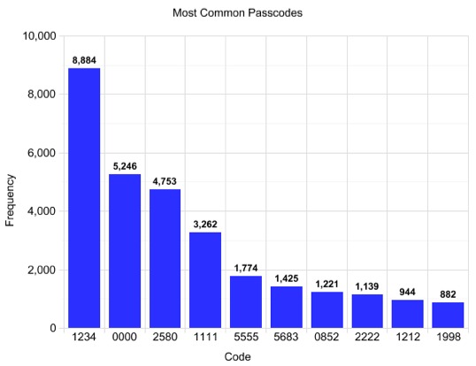
    For an app whose sole purpose is security, the top password is 1234. The second most common passcode was 0000. And the bronze goes to 2580, which as you probably know is simply a straight line down the middle of the keypad.

    Here’s a graph of the top 10 most common passcodes. It looks as though 1,425 people thought that 5683, which spells “Love,” was a good choice.

    Apparently, people also love to use years as their passcodes. Whether they coincide with dates of birth, graduations, or anniversaries, 1990-2000 were in the top 50 most used passcodes and 1980-1989 were all in the top 100. One is the most common digit for the first spot in the code, while zero is the most common in the last spot.

    So, guys, you’ve gotta step up your password game. I know you don’t want to make them so complicated that you forget them yourselves, but there is a happy medium between digits with no significance and 1111. And with these statistics in hand it is very likely that I could break into your phone with minimal effort.

    Formulaic passwords are never a good idea, yet 15% of all passcode sets were represented by only 10 different passcodes (out of a possible 10,000). The implication? A thief (or just a prankster) could safely try 10 different passcodes on your iPhone without initiating the data wipe. With a 15% success rate, about 1 in 7 iPhones would easily unlock–even more if the intruder knows the users’ years of birth, relationship status, etc.

    So next time you want to check out your boyfriend/girlfriend’s texts from last night, try a couple of these simple combinations. There’s a really good chance that one of them will work.

  • Netflix Redesign Rubs Many Users the Wrong Way

    Netflix Redesign Rubs Many Users the Wrong Way

    Popular movie service Netflix has undergone a redesign, and it while it’s certainly not unanimous, the overwhelming majority of users (at least on Twitter and in Netflix’s blog comments) do not like it.

    What do you think of the Netflix redesign? Let us know.

    Netflix Director of Product Management Michael Spiegelman said on the blog, “I’m excited to announce that we’ve updated parts of the Netflix website with a new look and feel to make it easier for you to find something to watch instantly.”

    “Starting today, most members who watch instantly will see a new interface that provides more focus on the TV shows & movies streaming from Netflix,” he added. “The title images are larger, there are more of them on the page and play buttons appear when you hover your mouse over the title images. Star ratings, information and other functions are available when you mouse over the title images. We’ve also made some changes to several pages on the site: adding more rows, and filling out the rows with more TV shows & movies, which you can find by hovering your mouse over the end of a row.”

    And now for the complaints. Are are some posted in the comments on the Netflix Blog:

    “The scroll-on-hover is terrible — the mere act of scrolling the entire page vertically causes random rows to start moving as they move under my mouse cursor and I never get to see the title on the far left or far right because it has already moved off screen and when I actually want a row to scroll, it scrolling is way too slow.”

    “Thanks, now I can instantly determine that Netflix.ca has nothing interesting to watch.”

    “Horrible! Everything feels as if it’s running together. I hate the way you have to hover over the last movie to see more in the row. They need to change it back or at least find some sort of compromise! I was in the middle of watching something when the site updated and when I came back to the main page my first reaction was to refresh the page twice hoping it would fix itself!”

    The new look is a little jarring at first, but it’s nice that the movie covers are larger. I think I’ll get used two it, but I do have two concerns. One is that there is no plain display of the movie title without mouse-over. If I want to quickly search through movies, it would be nice if their titles were easily comparable. The other concern is the horizontal scrolling. the fact that this has a fixed maximum speed makes it impossible for me to quickly skip past movies that don’t interest me. In addition, I have to move my mouse back and forth across the screen to poorly defined zones if I want to switch from scrolling right to scrolling left. I would much prefer a real scroll-bar.”

    “What happened to the ability to sort by rating? Now, you have to mouse over every. single. title. to find out that it only has two stars instead of being able to avoid it altogether. Also, the scrolling function is frustrating and slow.”

    “It’s quite dazzling how much I hate the new look and feel of the Netflix site. It might be a great idea for people on tablets or PS3’s or dealing with remote controls for input, but for those of us who have keyboards and mice (or trackpads), you’ve just made navigating the site considerably slower. Beyond just navigation, I think stripping out the titles from underneath, as well as the projected star rating, makes finding a movie on the fly just that much more difficult. Because nothing’s in alphabetical order at this point. Now we’re just looking at random movies in a random order, possibly by genre, but also possibly in some randomly selected genre that is somewhat related to a movie we didn’t actually mean to watch, because we accidentally clicked it when we were trying to scroll past it. It’s a horrible design. Flat-out. This is one of those design changes that’s going to be talked about on the tech-review sites later today, and not in a good way. It’s the Gawker or Digg debacles all over again, because you’ve deliberately made your site more difficult to use.”

    And the conversation continues on Twitter of course:

    Netflix redesign. Still horrible the second day. 2 hours ago via Twitter for Mac · powered by @socialditto

    The Netflix redesign feels like a mistake. Feels like it’s redirecting to an alternate mobile version unintentionally. http://t.co/X0HgyIw 2 hours ago via Twitter for Mac · powered by @socialditto

    I don’t like it at all, the scrolling is shotty at best. RT@shannon_patrick Holy #Netflix redesign, Batman! #whaahoppen? 4 hours ago via web · powered by @socialditto

    Wow, when did Netflix redesign their website? Switch it back, please! 4 hours ago via TweetDeck · powered by @socialditto

    RT @bySeon: The Netflix website redesign is awful. Kept loading up a movie when I really want to read the description. Not very mouse fr … 5 hours ago via web · powered by @socialditto

    Not a huge fan of the @netflix redesign. The padding is super awkward. 8 hours ago via web · powered by @socialditto

    Netflix redesign is great if you like ugly, functionless things. And I happen to, as a rule. 11 hours ago via web · powered by @socialditto

    The Netflix redesign hides information in mouseovers, removes sorting and filtering, and is grey and ugly. What did it actually improve? 13 hours ago via web · powered by @socialditto

    You get the idea.

    Again, that’s not to say there aren’t people out there that actually do like it. Every now and then, you’ll come across a positive comment, but then again, that’s the nature of the web. People tend to speak up more when they’re upset.

    I don’t think I’ve completely formulated my own opinion of the redesign yet. I’ll have to use it more, but I definitely like the mouseover play buttons.

    Play Button

    I also kind of like the side-scrolling functionality where you can just let your mouse sit there and browse titles as they hover by. While I’ve yet to experience it on a tablet, I can definitely see where this would be attractive on such a device.

    Either way, most major redesigns on the web get similar reactions at first, and then people get used to them, so I doubt Netflix is too worried about losing users over this.

    Is the Netflix redesign an improvement or a downgrade? Tell us what you think.

  • Adobe Launches Creative Suite 5.5

    Today, Adobe announced a new version of its popular Creative Suite software. The company has always aimed to enable Web designers and developers to produce quality products, and the new Creative Suite 5.5 Web Premium is no exception.

    Do you use Adobe’s Creative Suite? Tell us what you like about it.

    According to Scott Fegette, Adobe’s Senior Product Manager on the Creative Suite Web team, CS5.5 “helps Web pros work more efficiently and quickly without having to go back to school and learn a whole new slew of skills or technology.”

    While CS5.5 includes updates to Adobe Flash Catalyst, Adobe Flash Builder, Adobe Device Central, and Adobe Acrobat X Pro, the biggest updates come through Adobe Dreamweaver and Adobe Flash Pro. Through CS5.5, both Dreamweaver and Flash Pro enhance the workflow and sharing experience for Web developers.

    “We really sort of tried to gear all of our work in CS5.5 just to make it much more easier for Web professionals to either transition their existing projects, sites, and applications to a multiscreen experience, or in some cases, just literally start from scratch with a green field, dedicated mobile project,” said Fegette.

    In terms of Adobe Flash Pro, CS5.5 provides a new feature called Scale Content with Stage that allows users to scale proportionately and quickly. In the past, it could take a long time for users to convert animations and movie clips. Through this feature, this same action could take a matter of seconds.

    Adobe also made significant advances in HTML5, specifically its authoring tools and its support of jQuery mobile framework integration for browser-based content. In addition, it allows PhoneGap integration for the development of native and mobile apps. In other words, these improvements eliminate extra steps for developers and make their experience more seamless.

    The company has also revamped its pricing and subscription models to give customers the latest versions of their software without being locked into 18-month cycles. Adobe is giving customers both long-term and short-term options with prices starting at $89 per month.

    “The hope is that, literally, as soon as people get it installed and take a look at it, it’s just immediately going to feel like a natural extension of the skills they already learned,” Fegette added.

  • Photoshop for iPad Demoed By Adobe

    Adobe already has Photoshop Express available for iPad and iPhone (previously photoshop.com mobile). This is, however, only a light-weight version of the software greatly lacking in features comapared to the full Photoshop experience.

    That’s all going to change soon. Adobe demoed a new full version of Photoshop at Photoshop World 2011. Here’s a brief clip uploaded to YouTube, which shows the new Photoshop in action:

    (Tip of the hat to Photography Bay and on YouTube).

    The way this version handles layers looks particularly cool.

    A fully-functioning version of Photoshop for the iPad (and other tablets) would no doubt make the devices an even more attractive option for businesses/enterprises.  Of course, there are already plenty of apps in the App Store that can easily be used to replace many features of Photoshop (for a lot less money, I might add), but Photoshop is still the leader of its genre of applications.

    Adobe has not put a release date on Photoshop for iPad, but designers and businesses that are already heavily using iPads will certainly be eagerly awaiting it.

    On a related note, Adobe also introduced the Photoshop Family Feedback site at feedback.photoshop.com. This is simply a place where users can leave ideas and requests for the Photoshop team, as you may have guessed. This could be particularly helpful in the development of the new iPad version.

  • Flash to HTML5 Converter from Adobe

    Adobe Labs has released a tool for converting Flash FLA files to HTML5. The tool, called “Wallaby“, is simply a preview of an experimental technology that Adobe’s engineers have been working on for this purpose.

    “This allows you to reuse and extend the reach of your content to devices that do not support the Flash runtimes,” Adobe explains. “Once these files are converted to HTML, you can edit them with an HTML editing tool, such as Adobe Dreamweaver, or by hand if desired. You can view the output in one of the supported browsers or on an iOS device.”

    “Please note that not all Flash Professional features are supported in the HTML5 format,” the company adds. “The Wallaby Release Notes describe what features are supported, what differences we have already discovered between the various browsers, what device variations have been found, and any currently known issues.”

    The list is pretty big, so I’ll let you peruse that on your own. It is only available in English currently.

    “Having come here specifically to build standards-based Web animation software, I’m delighted to see this release and a ton of other HTML5 initiatives from Adobe,” says Adobe’s John Nack. “As long as the company puts solving customer needs ahead of politics, I predict good things.”

    Adobe stresses that Wallaby is not currently part of either Adobe Creative Suite or Flash Professional. Wallaby is available as a free download on Adobe Labs.

  • Twitter Develops Their Own ‘Tweet Button’

    Twitter Develops Their Own ‘Tweet Button’

    It’s no longer a matter of answering the micro riddle, “to tweet or not to tweet.” Twitter helps you simply Tweet everything that moves you. While this capability has existed through third-party services over the years, Twitter is rolling out a dedicated function to harness the power of the “interest graphs” that you weave.

    Not only can you share links with those who follow you, Twitter is extending its “Suggestions for You” feature to assist in the curation of your social nicheworks. After a link is shared, relevant individuals who share your affinity for topics and themes will appear. This allows you to expand your social graph and slowly shape it into a series of interest-related graphs or contextual nicheworks.

    For content publishers, from casual bloggers to influencers to the media elite, Twitter only requires the installation of a few lines of code to set the stage for broader distribution within an ecosystyem where the appetite for “what’s happening” is insatiable.

    Here, I’ve used the TweetMeme to provide sharing functionality. TweetMeme is partnering with Twitter to ensure that this functionality run seamlessly. The company is also expanding its services to fine tune the social web and shape the future of content curation.

    DataSift provides developers with the capacity to to build precise streams of data from 60+ million tweets sent every day.

    – Tune tweets through a graphical interface or our bespoke programming language
    – Streams consumable through our API and real-time HTTP
    – Comment upon and rank streams created by the community
    – Extend one or more existing streams to create super streams

    Find out more on the new DataSift blog or follow @datasift

    Comments